A few weeks ago I co-wrote a post with Sarah Johnson from Tuck Sleep – a non-commercial community devoted to improving sleep hygiene, health and wellness through the creation and dissemination of comprehensive, unbiased, free web-based resources – about the science behind well-designed bedrooms and in particular, why some design choices create a relaxing sleep environment. The conclusion was that the best colour to decorate a bedroom was blue! “Blue is associated with calming and soothing. It can promote serenity and prevent nightmares.”
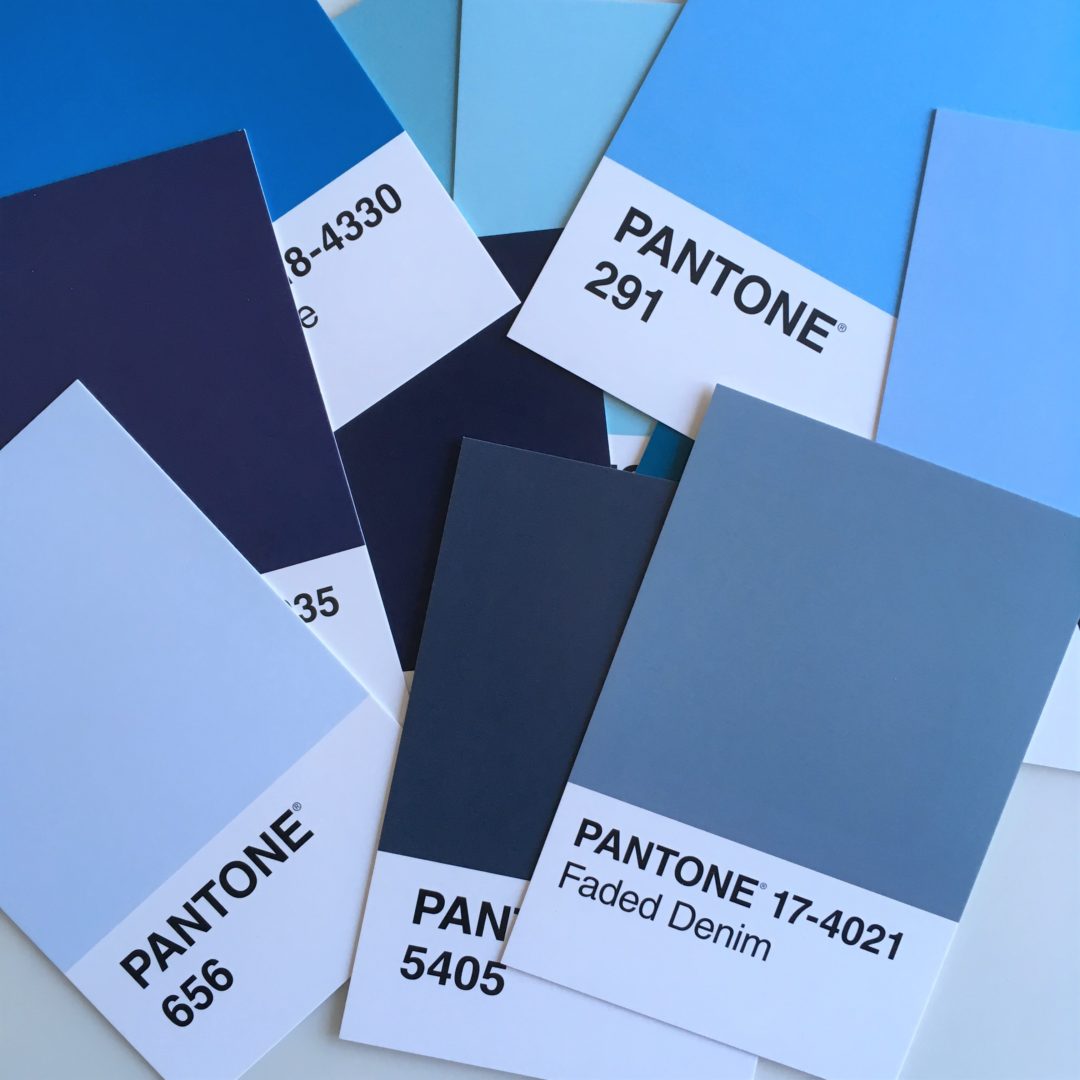
But there are so many blues… So I thought I would share with you some of my favourite blue paints and bedrooms.
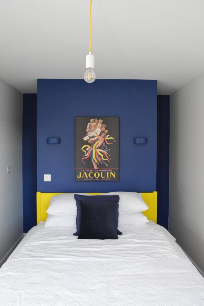
Starting with a blue I have used already in my own home: Dulux Sapphire Salute. This is our spare bedroom. I wanted a real navy blue – with no grey – to perfectly contrast with the yellow.
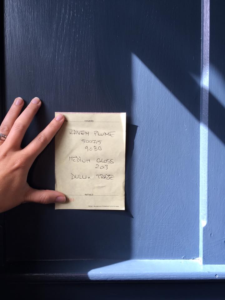
I came across another Dulux blue in a pub in the Cotswolds, Raven Plume. I of course had the manager off into the shed to get me the paint reference. It’s a greyer blue but as you can see it’s beautiful in the sun.
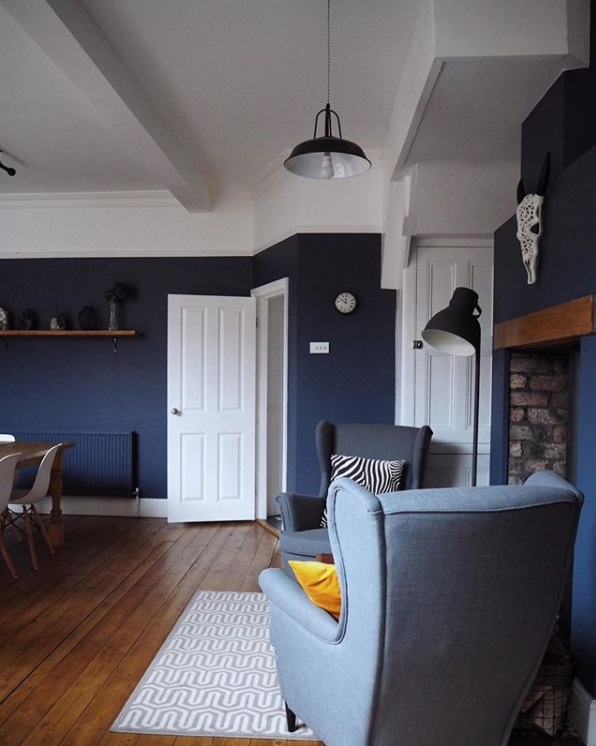
Dulux Breton Blue is a darker than Raven Plume, so most people only use it on a feature wall pairing it with a light grey. But I absolutely love how Lucy from itslucy went bold with all walls and paired it with white.
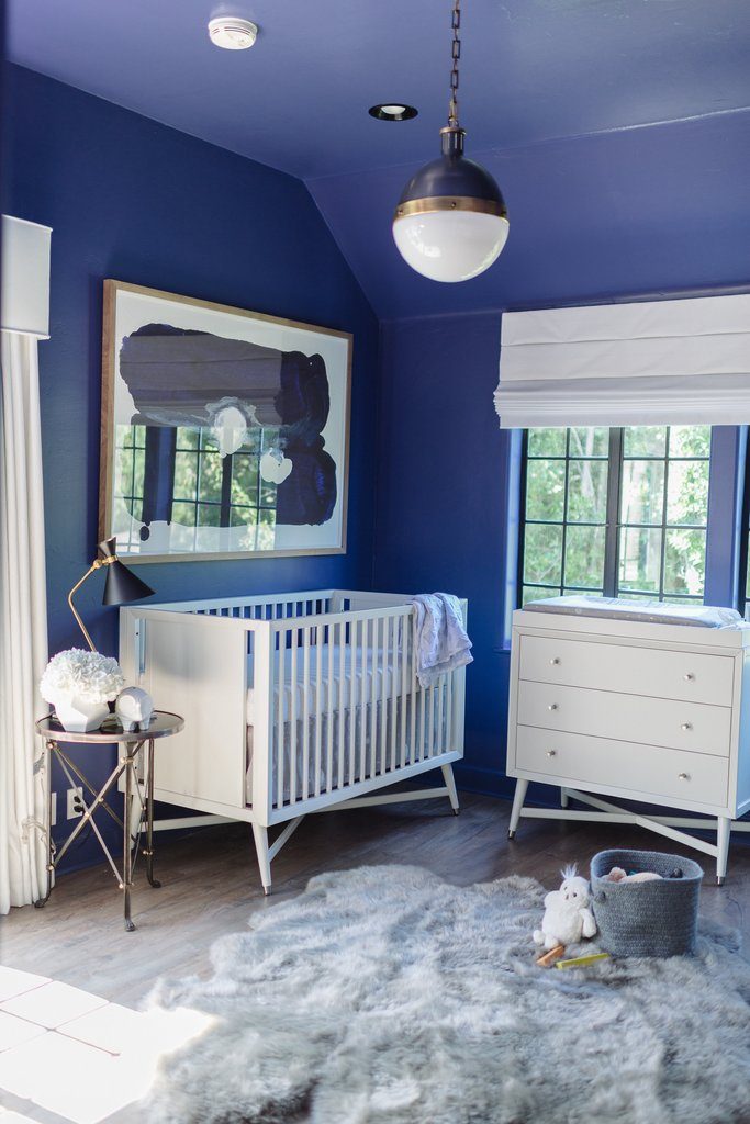
Farrow & Ball Pitch Blue is a strong cobalt blue if you’re looking for brighter rather than darker. This is Tiffani Thiessen’s son nursery and I love the painted ceiling. Pairing it with white keeps the room bright and light.
A more true blue is Farrow & Ball Drawing Room Blue. This rich blue is less purple than Pitch Blue and more lively than navy Stiffkey Blue. Here is has been paired with Blackened in Liz Lawson’s home.
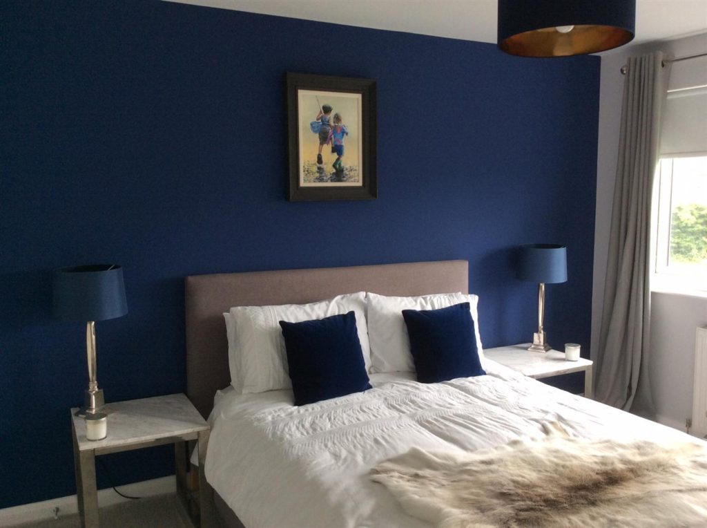
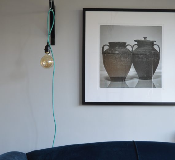
All this research into colours completely inspired me and I decided to repaint my bedroom blue! It was grey – which is in terms of science OK – but hey, why wouldn’t I go for the winning colour? So which blue did I pick? Farrow & Ball Stiffkey Blue.
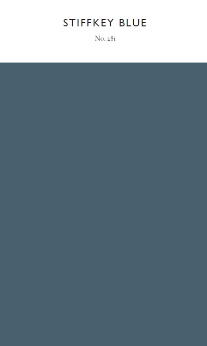
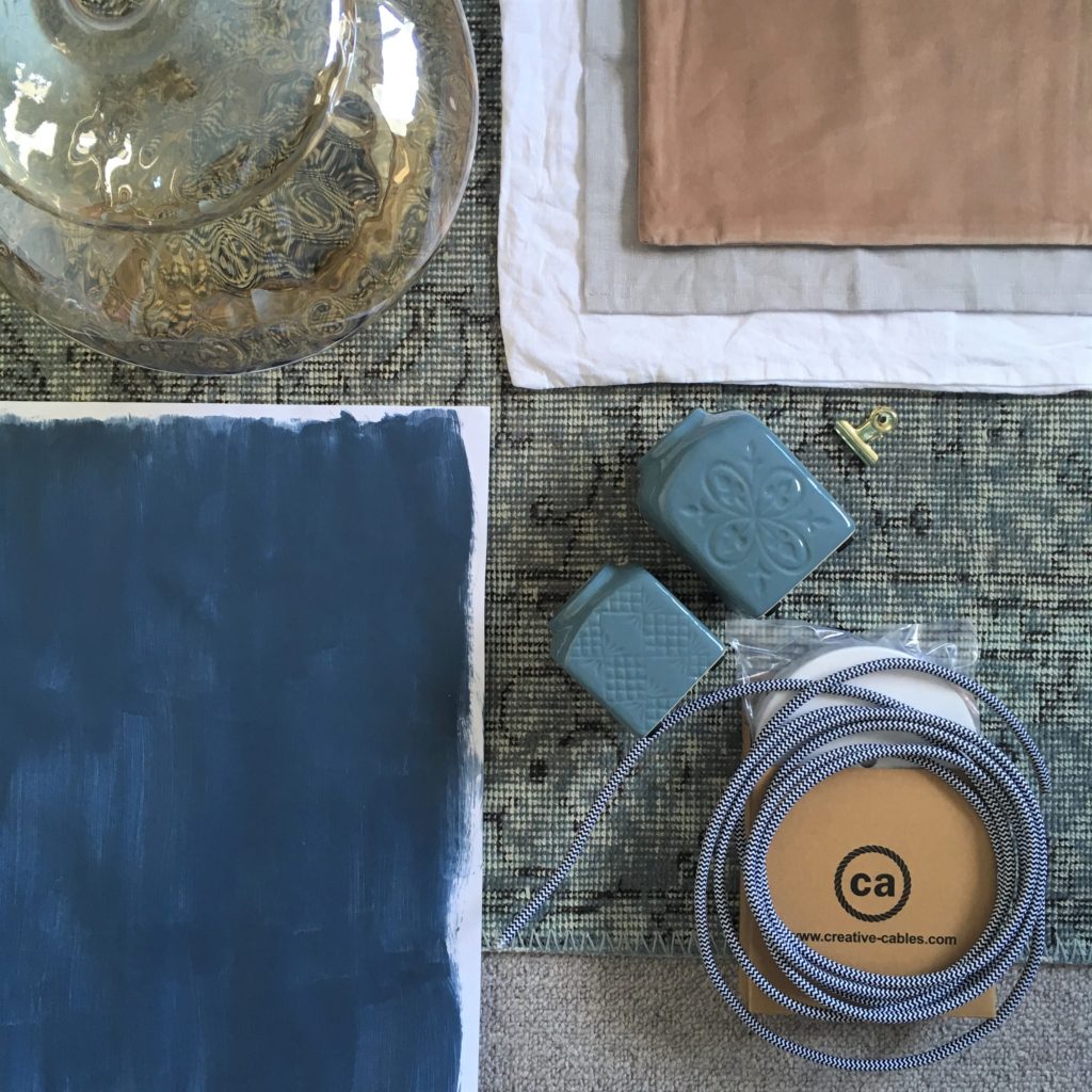
Farrow & Ball describe it as “an inky blue is named after the Norfolk beach where the mud, along with the cockles, share a particular deep navy hue. Although traditional in feel, Stiffkey Blue is often used as an alternative to Down Pipe to create a richly dramatic space with a more contemporary finish.” For me it was the perfect dramatic dark grey blue to pair with the light grey and petrol elements I was keeping in the room. And I decided to pair it with a warm champagne/camel colour. Here’s the design palette.
What do you think? Which blue would you pick?
I hope you’re inspired!
Update: to see the finished Stiffkey Blue bedroom click here.