So when Sarah Johnson from Tuck Sleep – a non-commercial community devoted to improving sleep hygiene, health and wellness through the creation and dissemination of comprehensive, unbiased, free web-based resources – got in touch to do a guest post for HMP about the science behind well-designed bedrooms, I was intrigued. She explained that the team at Tuck Sleep has been researching the science behind sleep, and has collected some great information and of particular interest to me, why some design choices create a relaxing sleep environment.
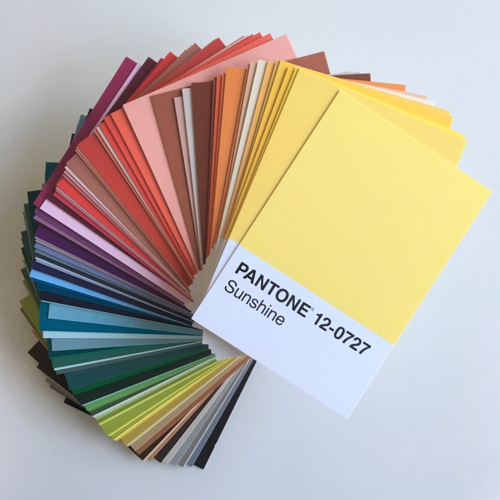
If you follow my blog you will know that I grew up surrounded by colour talk (my dad has always been an artist at heart, even if he is a sailor by trade, and my mum is a curtain maker), I studied art at school and university, and now spend most of my days either looking at colour charts or with my hands covered in paint. So yes I have spent many a lesson studying the colour wheel, but colour psychology is something I only briefly touched on during my PR days.
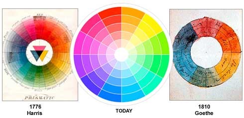
Colour wheel 1776, 1810 and today – image from Communicatorcorp
So I suggested to Sarah a combined post about colour in the bedroom! Sarah is American so in a “you say tomato, I say tomato” kinda way, there’s some colour and some color in this post 😉
“People may put a lot of thought into their mattress choice, furniture, and accessories when they’re designing their bedroom. But they shouldn’t make their color choices an afterthought, as it can influence the quality of your sleep.” said Sarah.
Why is the quality of your sleep so important? Well an international study conducted across 14 different countries by Aviva in 2017, suggests UK adults are some of the worst sleepers in the world and recent research from the University of Oxford demonstrated that a lack of sleep in itself can cause mental health issues such as paranoia, depression and anxiety.
“Colors can invoke certain moods and feelings. People understand that red is bold and exciting, while blue is often relaxing and reassuring. These feelings can translate into more or less sleep. A color that is too stimulating can make it too difficult to relax and fall asleep. However, relaxing and reassuring hues can help you calm down and drift off. What works well in your living room, dining room, or bathroom may not be an excellent choice for your bedroom. While you may want social and lively feelings in living areas, you’ll want a more calming color in the room where you sleep at night.” continued Sarah.
I think this inclusion of colour psychology in interior design is a fascinating topic and one I am seeing more and more of it as people want to move away from trends and find an interior style which suits them. Of course you can add in an on trend Monstera leaf but the foundation of the design should make you feel happy. If you want to read more about colour psychology in interior design follow the colourful and talented Sophie Robinson who works with Fiona Humberstone hosting colour psychology for interior design courses. Sophie’s recent collaboration with Habitat #banthebeige is based on colour psychology and whether you’re a Spring, Summer, Autumn or Winter personality.
So marrying colour psychology and the science behind a good night’s sleep, Sarah added “Certain colors tend to be more sleep-inducing, including blue, yellow (however careful as it can be intellectually stimulating), and green. Bedroom colors to avoid include red, brown, and purple. In fact, Travelodge conducted a study to identify the top bedroom colors for better sleep. Blue came in first with an average of seven hours and 52 minutes of sleep, followed by yellow (seven hours, 40 minutes), green (seven hours, 36 minutes), silver (seven hours, 33 minutes), and orange (seven hours, 28 minutes).“
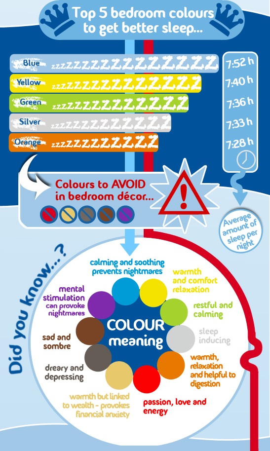
Extract of image from Travelodge.
“Color choices abound throughout your bedroom. Although wall color is the most obvious and major influence, don’t forget other color factors. Your bedspread color can significantly influence the mood of your room. If you like a color, but don’t want to commit to an entire wall of it, consider using that color in an accessory such as a pillow or lamp. Adding an accent piece is also a good option if a color is too bold and exciting for walls, but you still want to incorporate it into your bedroom without sacrificing sleep.”
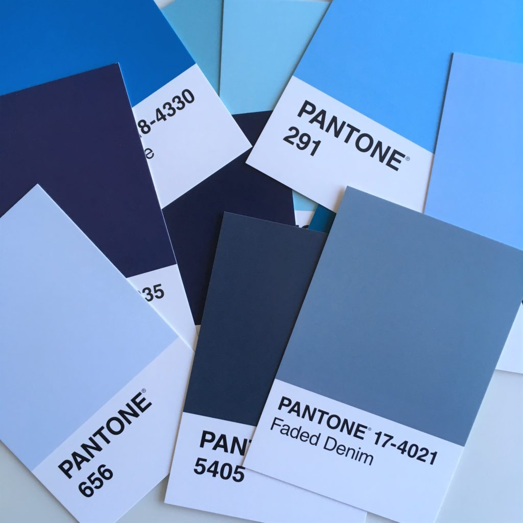
In terms of science, blue for the bedroom is a clear winner. But green, grey and pink should also help you get a good night’s sleep.
- “Blue is associated with calming and soothing. It can promote serenity and prevent nightmares. Blue can sometimes look too chilly, so look for a blue with a warm undertone.”
- “Green is associated with nature, calming, and energy. It can offer feelings of security and stability.”
- “Although black is too dark and dreary, a light gray or silver can be sleep inducing and a softer tone than bright white walls.”
- “Pink is associated with love, but unlike red which can interfere with sleep, it is peaceful and restful.”
Sarah finished by saying: “When choosing a bedroom color – wall or accessories – consider the influence each color can have on your sleep!”
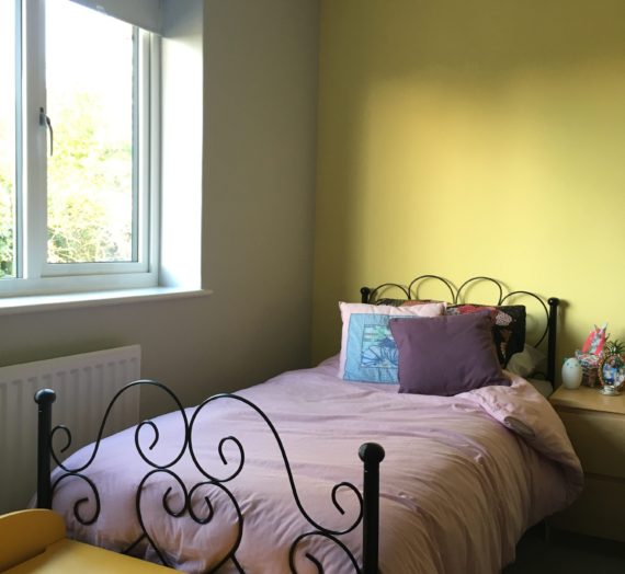
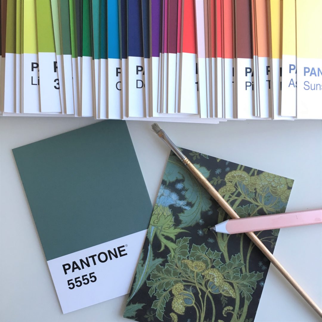
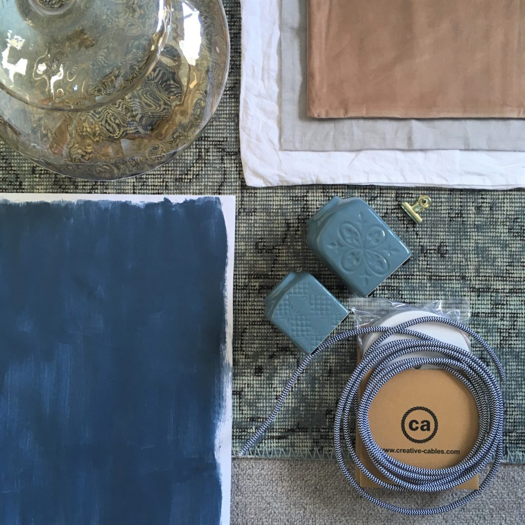
All this research into colours has completely inspired me and I am currently repainting my bedroom blue! It was grey – which is in terms of science OK – but hey, why wouldn’t I go for the winning colour? So here is the palette for the redesign, I can’t wait to share the results with you and explain how I picked the blue paint – all inspired by science! *update: to see the blue redesign click here*
I hope you’re inspired and happy sleeping!
PS the small print: Co written with Sarah Johnson from Tuck Sleep. Not sponsored just inspired.