No8 is my mum’s flat in L’Isle Sur La Sorgue, the town I grew up in as a teenager. It’s been a rental income for a few years but my mum has decided to move on and sell it. It is a nice big studio flat but over time it had become dated so buyers weren’t interested. I offered to re-design it to get it market ready. It was clear from the feedback of visits that people wanted the bedroom to be separate and that even though it was a large flat at 37m2 it didn’t seem it, so I needed a design that would show space and ‘push the walls’ back.
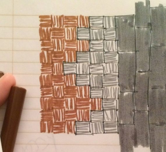
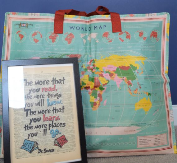
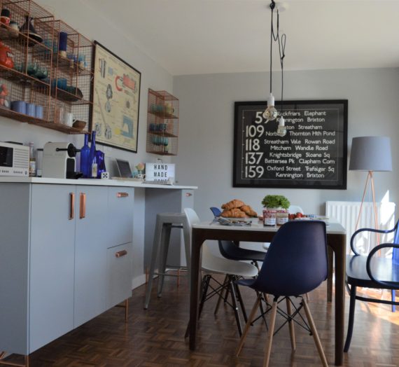
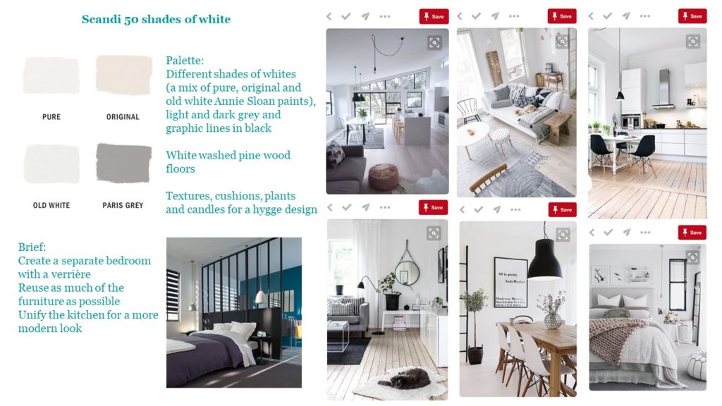
Here’s the design pitch I did for it: a Scandi hygge design with 50 shades of white.
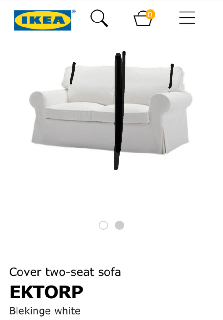
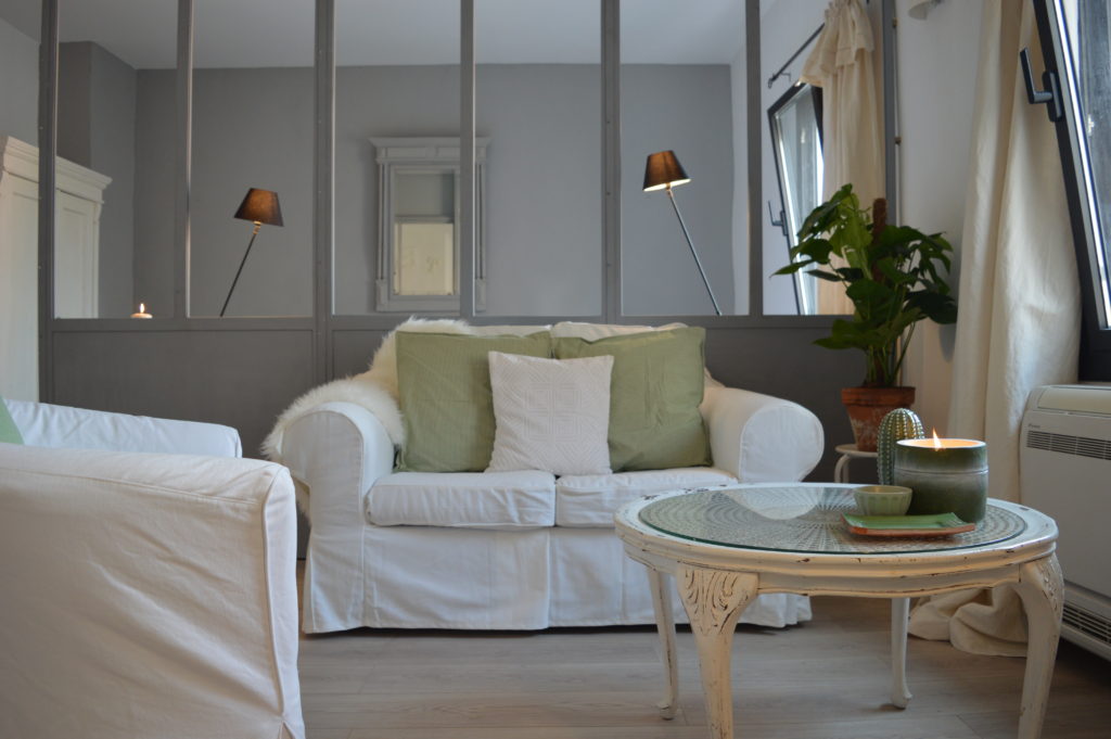
 One of my design principles is to use – as much as I can – the furniture on site. There was a tired non brand sofa in the flat so after measuring it, I did a comparison with the IKEA sofa covers. The EKTORP sofa was the best fit so I sent my mum – a curtain maker by a trade – this hack: remove width in the middle and square off the back cushion covers. Being able to adapt ready-made to what you have, is a great way to save money.
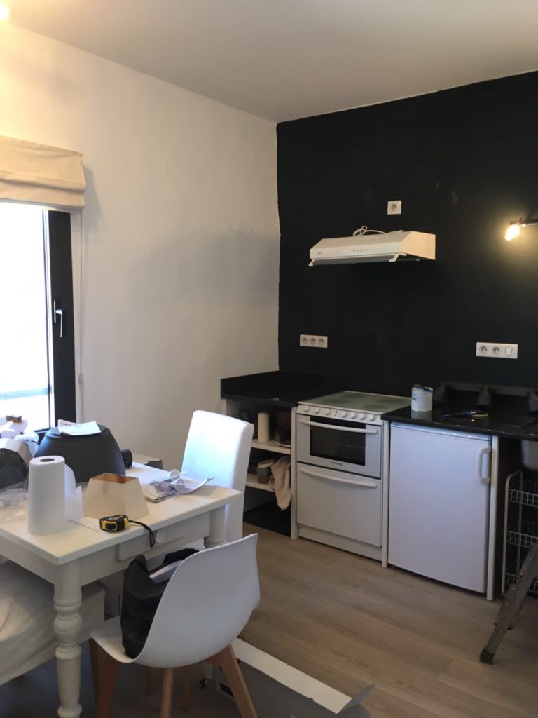
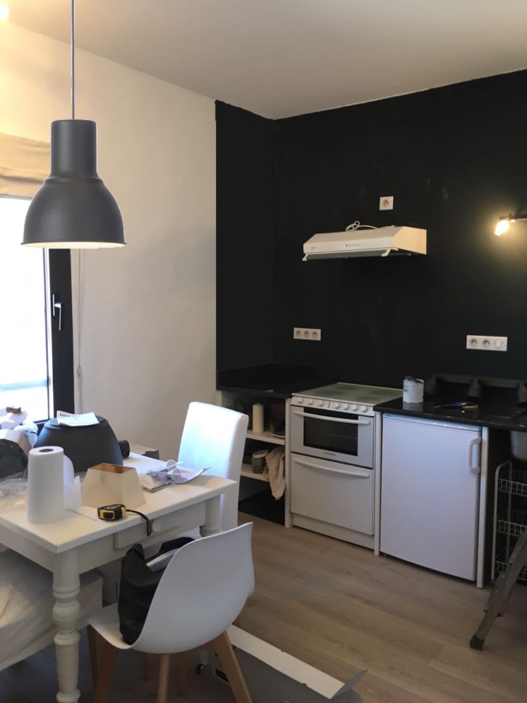
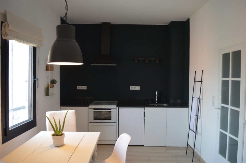
I live in England and the project was in France so I had express my vision from afar. For example, my design to ‘push back the walls’ and modernise the existing kitchen by making it monochrome was to paint the walls Farrow & Ball Railings. My brief was to paint from the beginning of the worktop top to the end, to give a real feeling of depth. This was the photo I received via whatsapp with only the back wall painted; my mum wasn’t convinced. I quickly edited the photo in paint.net to add the full paint effect and even added in the pendant lamp. Sometimes you need to see the end result to believe in it. Up went the masking tape!
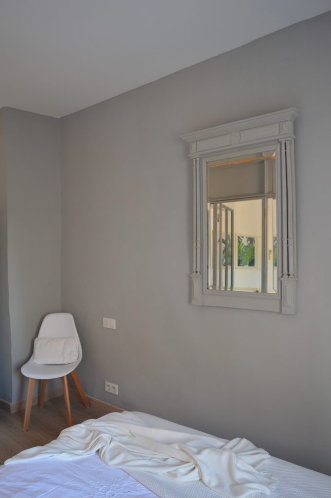
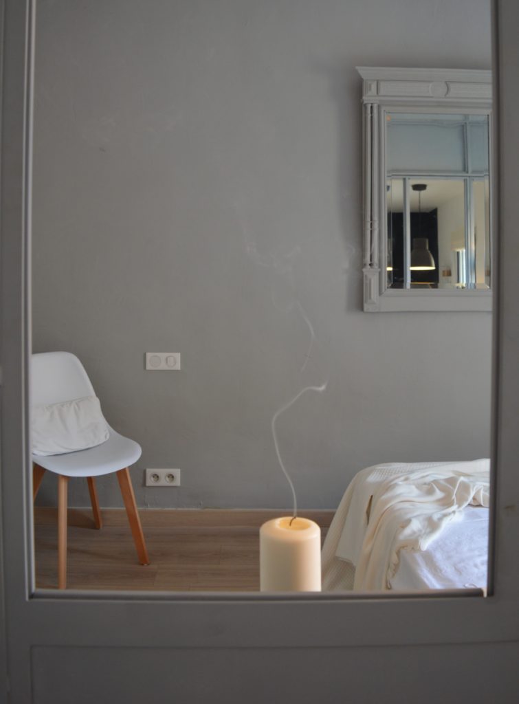
So here are the before and after photos. The verrière was key to create a separate bedroom. Painting it to match the back wall means it doesn’t feel too harsh and the windows let the light shine through from room to room.
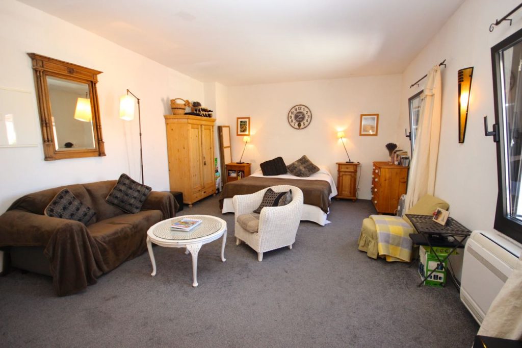
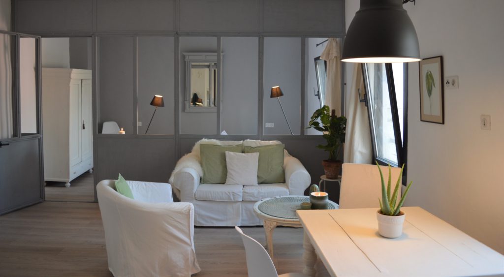
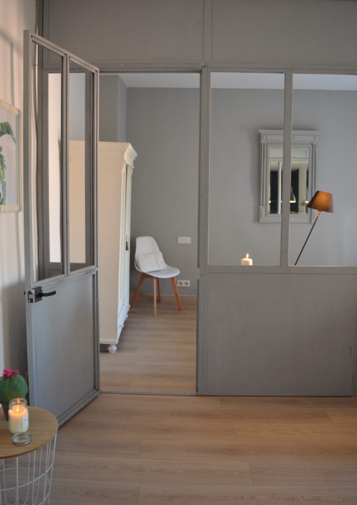
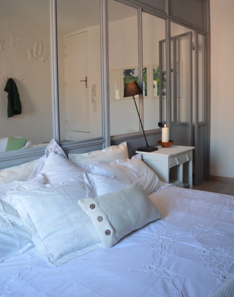
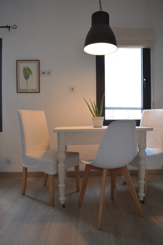
The Scandi design palette was 50 shades of white so we had all the wood furniture already in the flat painted a mix of Annie Sloan paints: pure, original and old white. The floor was unified by using white washed wood effect laminate. And my mum raided her linen cupboard for mismatched white sheets and cushion covers.
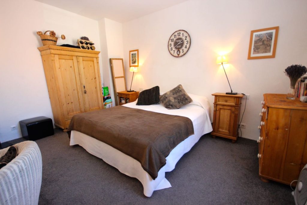
The window frames are black so I added some new modern dark grey lighting (IKEA HEKTAR pendant lamp and 3 spot ceiling track – fixed to the wall). There were only 2 dining chairs in the flat (which my mum shortened the covers for a more modern effect, also showing the wood of the legs) so I did add two new chairs from CASA.
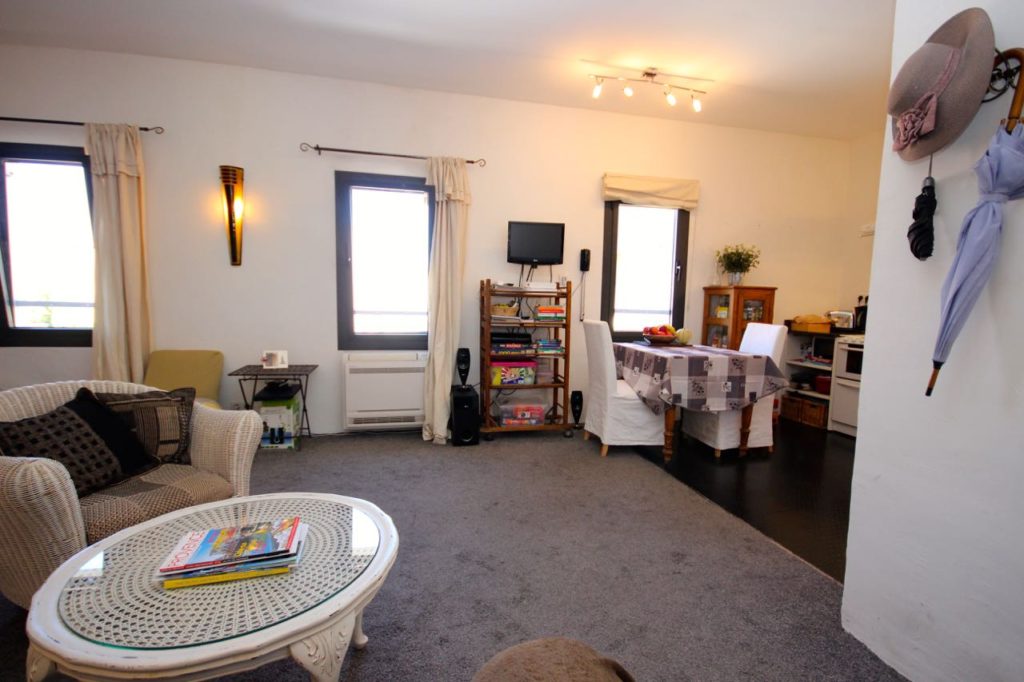
Here is the before and after kitchen, with the Farrow & Ball Railings walls. The dark grey spot lights, new VINDRUM hood and the white cupboard doors make this kitchen look modern and monochrome, perfect for a Scandi flat.
Small aside: check out the cooker. It’s a hob, oven and dishwasher all in one. Genius!
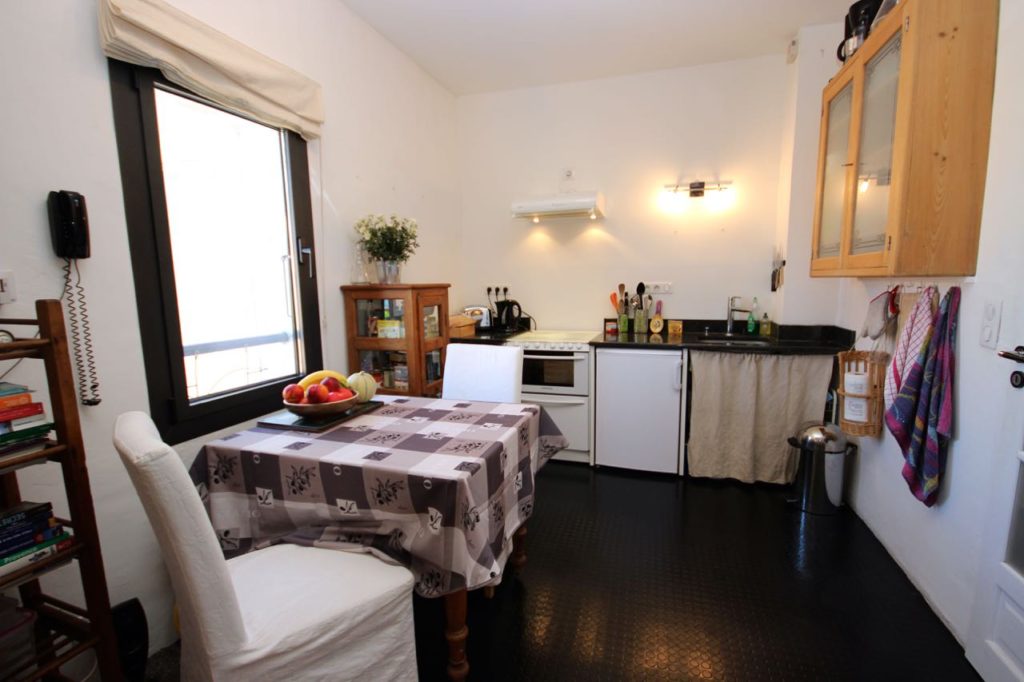
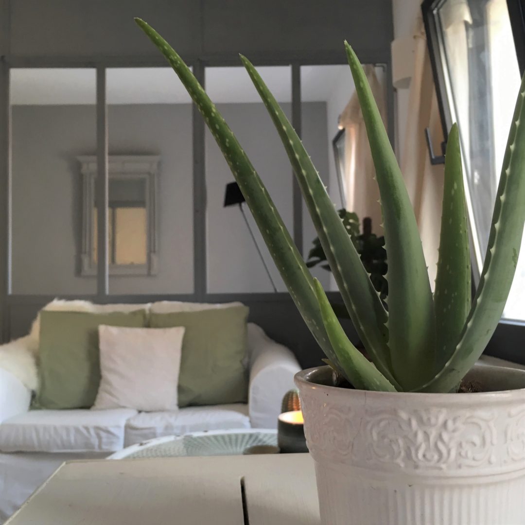
The wicker chair you can see in the before photo had seen better days, so I suggested my mum searched Facebook buy and sell groups for an IKEA TULLSTA tub armchair with white cover to add to the design. A hygge design calls for textures, cushions, plants and candles. The addition of green seemed so natural. We picked a Monstera plant to echo the set of 2 IKEA posters TVILLING “Big leaves ii” (these are from the new IKEA catalogue and they are very on trend and only £6 for two posters). And an Aloe Vera plant… well because I love them!
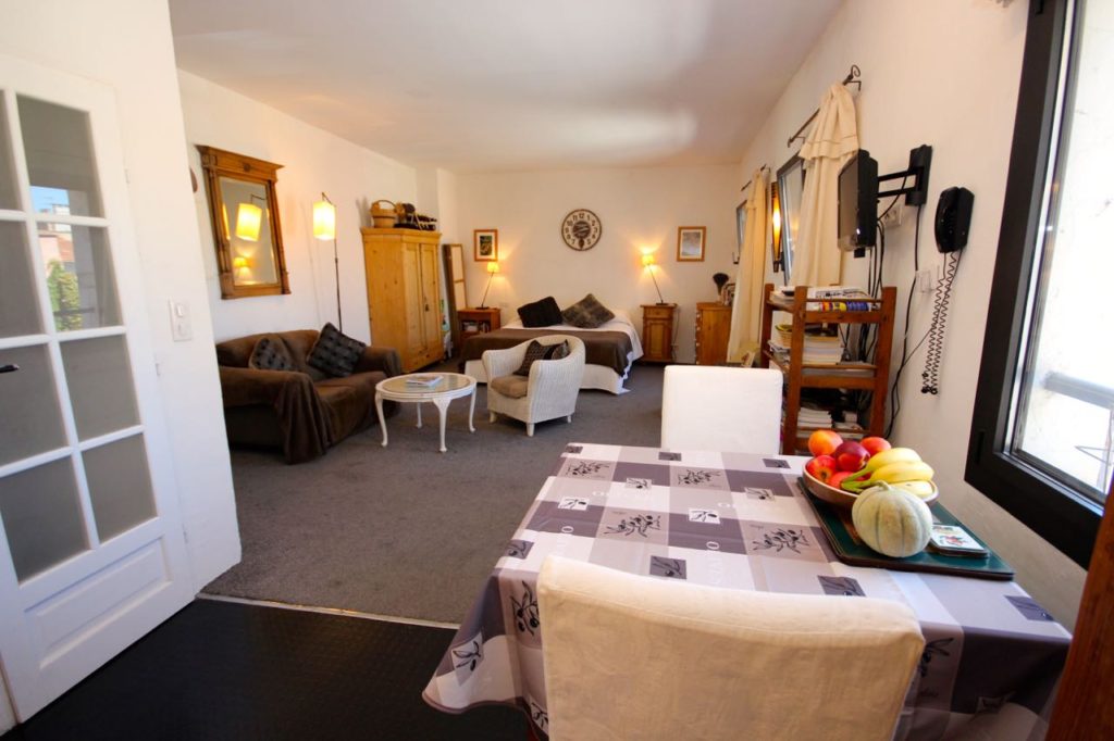
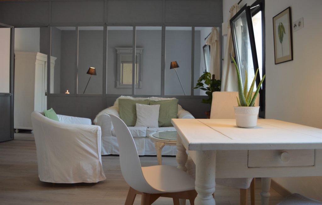
Here is the IKEA EKTORP hack. A great cost effective way to update a sofa.
This has really been a true HMP project using what was there and cost-effective tricks to bring in a great design which is kind on the wallet and on the planet. Fingers crossed for a quick sale! *UPDATE: It sold 3 weeks after being put on the market!*
Candles out. I hope you’re inspired!
