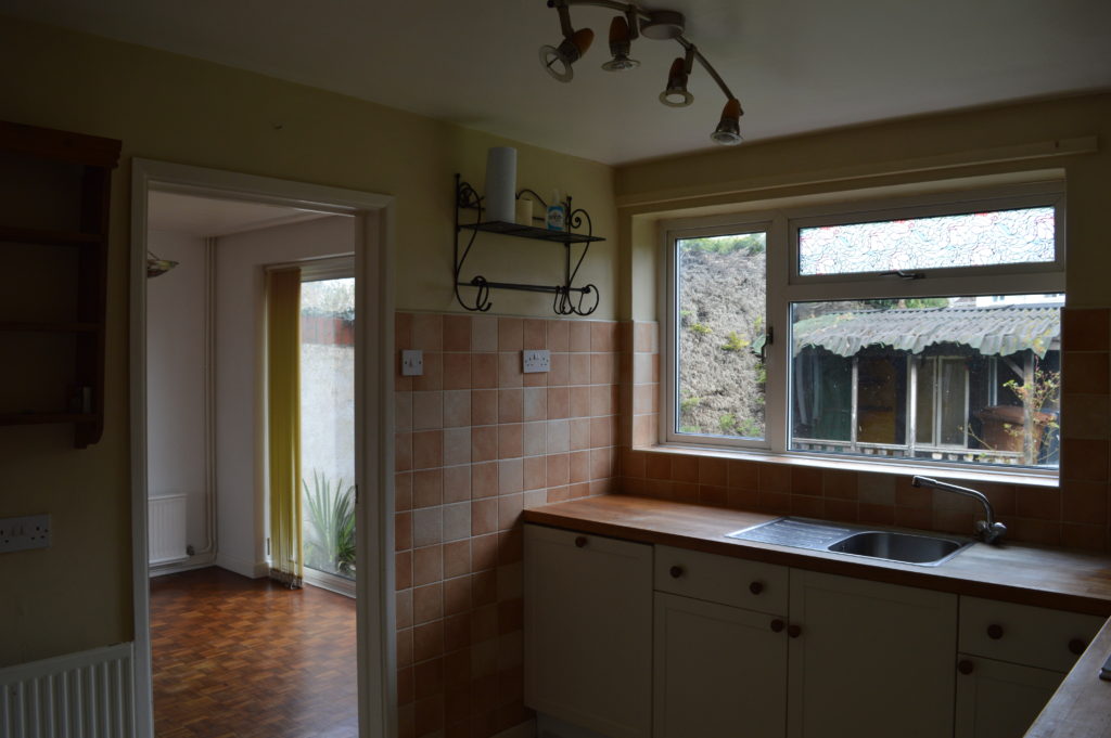
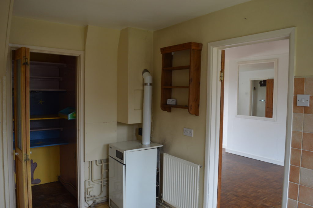
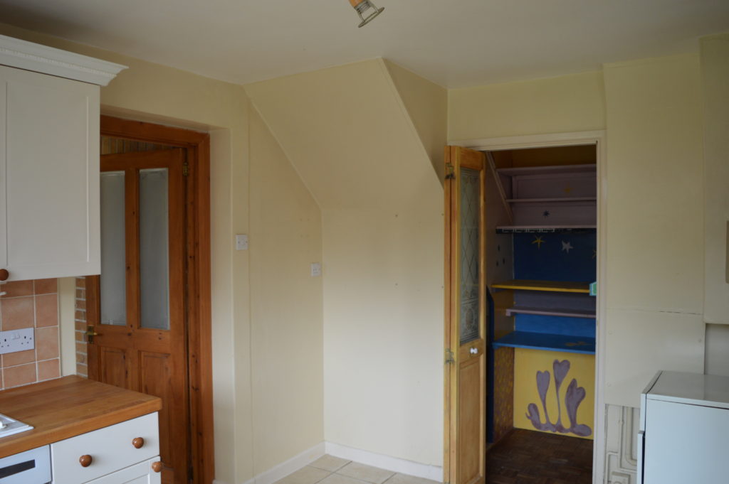
As they say: kitchens are the heart of the home. Well this was the kitchen when we bought the house and to follow the analogy, this kitchen was in need of heart surgery. It was dark, you couldn’t eat in it and it was also a dead end – you could only access it from the massive dual aspect sitting room. Not ideal if you have a car full of groceries!
And here it is now: after open heart surgery!
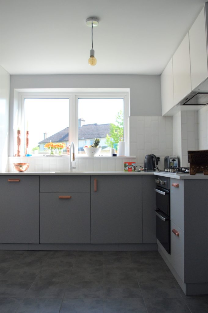
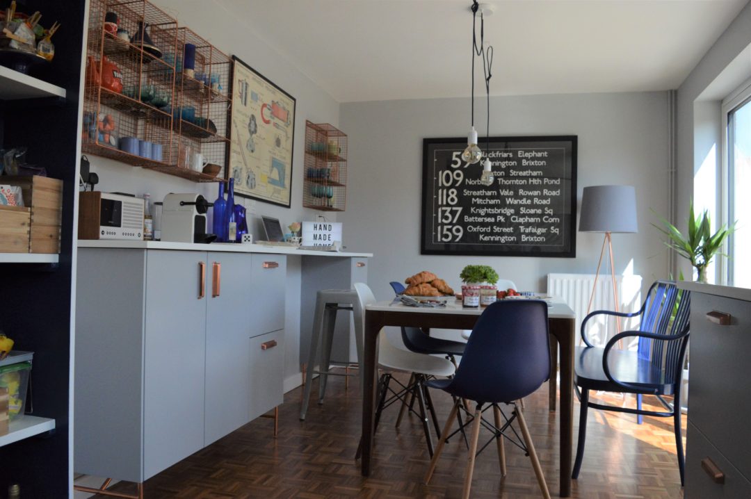
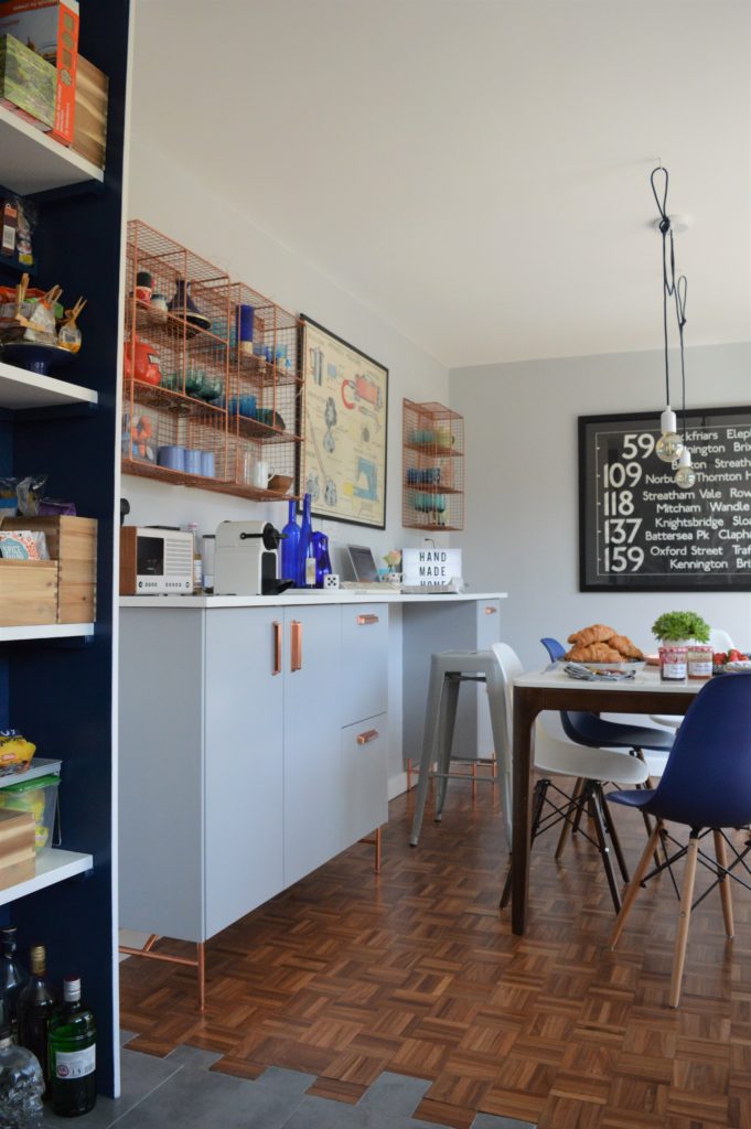
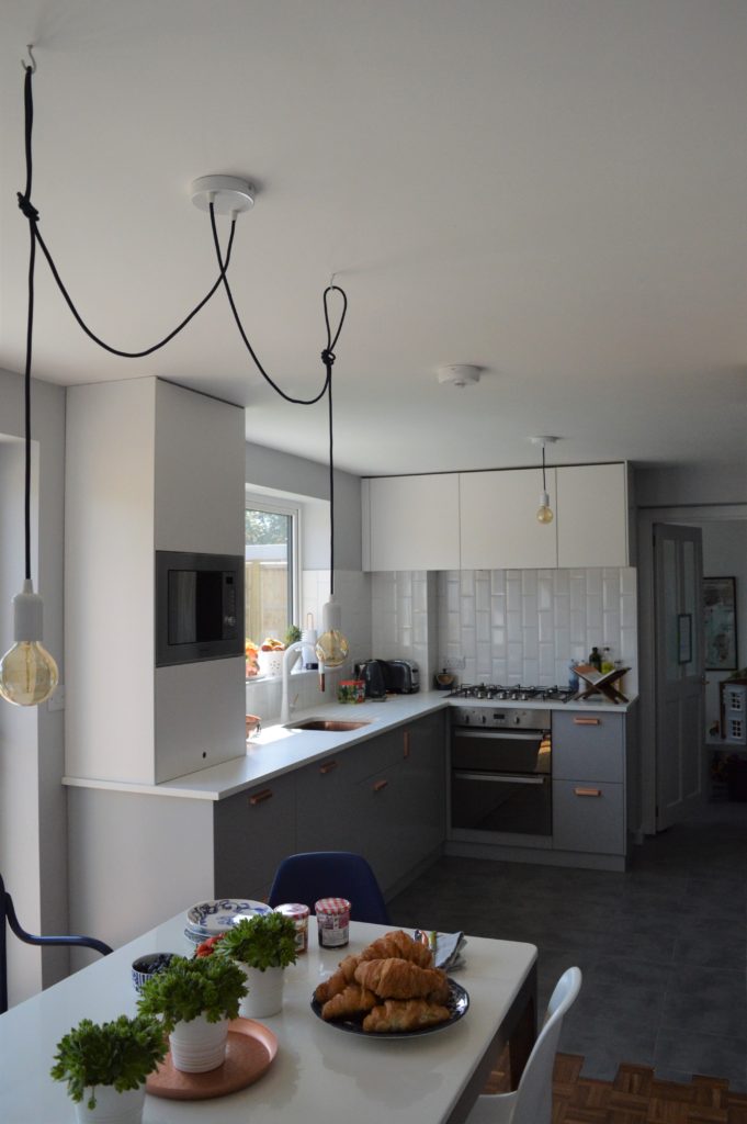
I’m not going to bore you with all the structural changes but as you can see it’s now a bright kitchen/diner. To lighten the room, I wanted a kitchen that was light but not all white.
I love IKEA kitchens – this is the 4th one I’ve designed and they couldn’t be more different. Here I used the new METOD units with the VEDDINGE door and drawer fronts in grey below the worktop and the HÄGGEBY white door fronts above. Both these doors are matte – essential when you live with kids. A minerva worktop in white makes the design look more expensive (minerva is a man made material which looks and feels like stone but without the price tag and without the need for specialist tools – it can be fitted using wood working tools). But to make the worktop even more cost effective, the off cut length from the main kitchen worktop was used in the utility room and the off cut width from the sideboard was used for the shelves in the pantry.
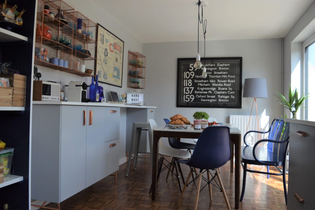
To give the kitchen a more personal touch I introduced copper details with the sink (from Olif), the handles (found on eBay), the legs for the sideboard (which are from superfront) and then repeated in pops around the room in the accessories.
We knocked down the old pantry so you can access the kitchen from the entrance hall which makes more sense. And split the old massive sitting room in two with the wall you can see in the photo below.
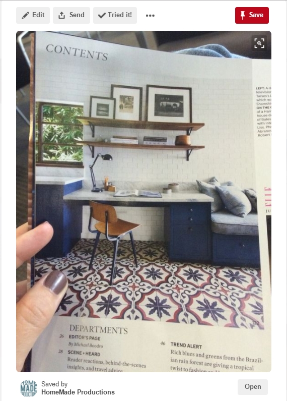
Years ago I took this photo of a magazine – and pinned it – as I loved the idea of having an office area in the kitchen. The reality is the kitchen is where I do my online grocery shopping, blogging and my eldest does her homework so it makes sense to make a dedicated area rather than losing half of the dinning table.
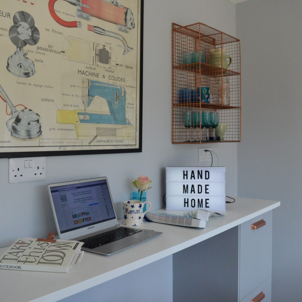
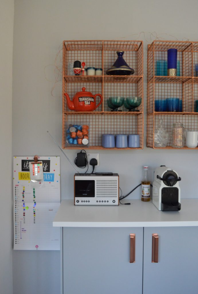
And here is ours. I am currently sat here writing this blog post. I have a power point for my laptop right in front of me and the power point to my right has USB points. The drawers to the right have some office stuff in them but really, if I need to clear up my office, I chuck everything in there and close the drawer. I think it’s my favourite bit of the kitchen.
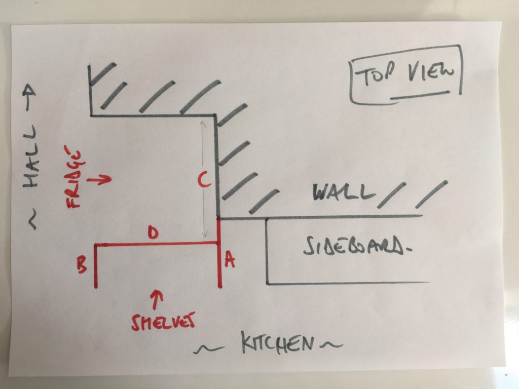
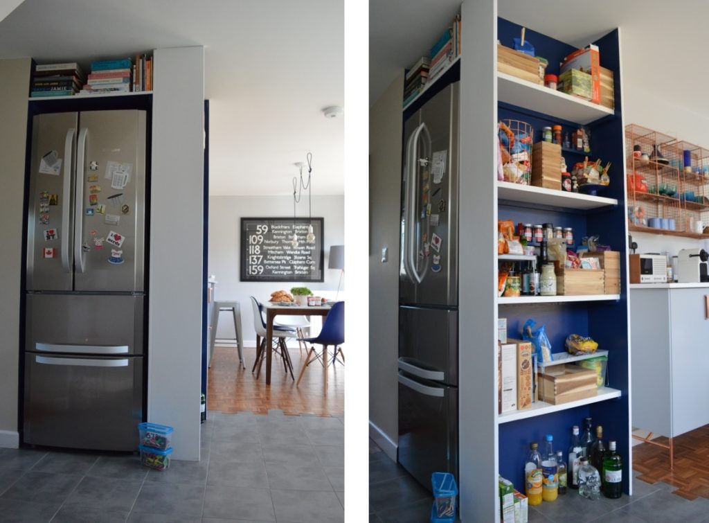
Having lived in the Canada, I knew I wanted an American fridge. Once you go big, you can’t go back! To make the most of the space and to incorporate a pantry, I designed a built in for the fridge which had the pantry down one side. Open pantries are not for everyone but as I borderline on “Sleeping with the enemy” when it comes to my tins, I love mine. And it completes the golden triangle of kitchen designing with the cooker and the sink.
To keep the room as light as possible, I went for white cabinets above the worktop, with push handles and white metro tiles. I had the metro tiles laid vertically rather than the classic horizontal design to give the impression of height. The cabinet you can see on the left on the worktop with a drilled finger hole, lifts up to reveal all my kitchen gadgets (like the mixer and the ice cream maker) and there are power points at the back of the cabinet so they are ready to go.
I love the copper grid shelving units. They are from Oliver Bonas (but they are sold out) and they display my grand parents blue glass collection which I’ve added to over the years. The kitchen is painted my favourite grey Dulux Night Jewels 5.
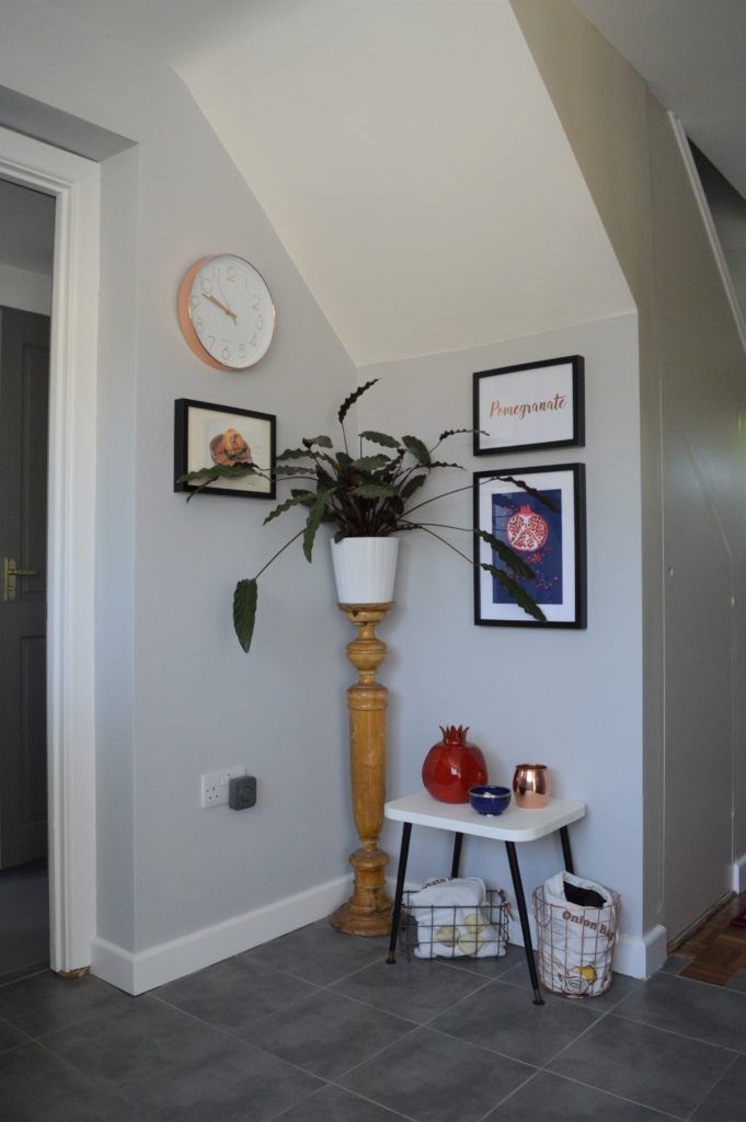
Instead of the kitchen being a dead end it is now the heart of the home and it leads to the girls’ playroom, a downstairs toilet and the utility. And I love how this corner now houses my pomegranate gallery wall.
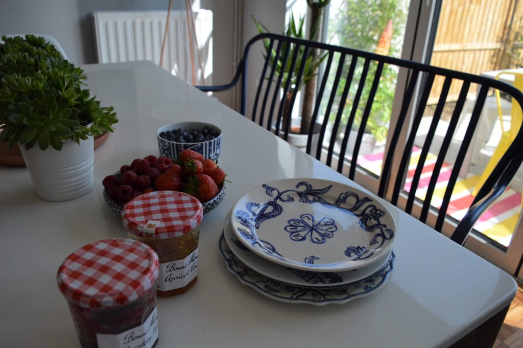
It’s also our link to the garden. And I can’t wait to finish the garden and deck so we can have the bi-fold doors open to make the kitchen and the garden one big space.
I hope you’re inspired!

