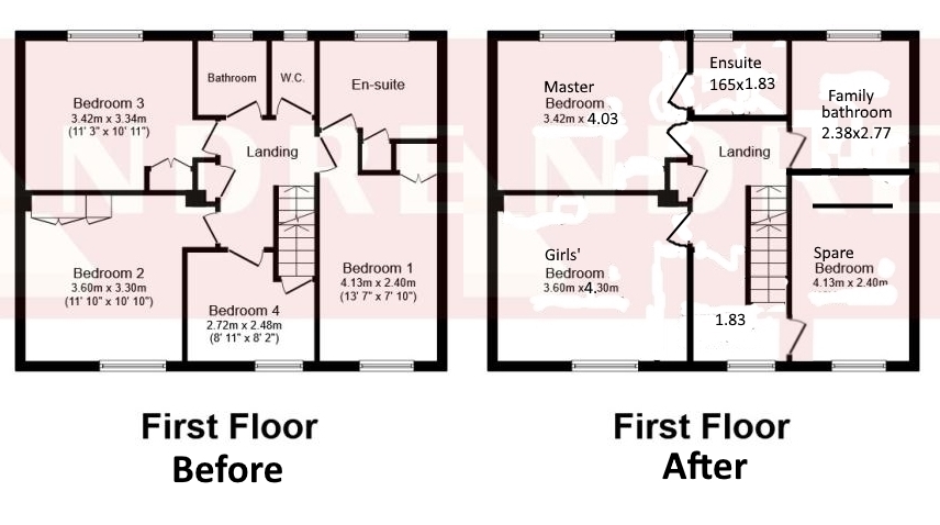
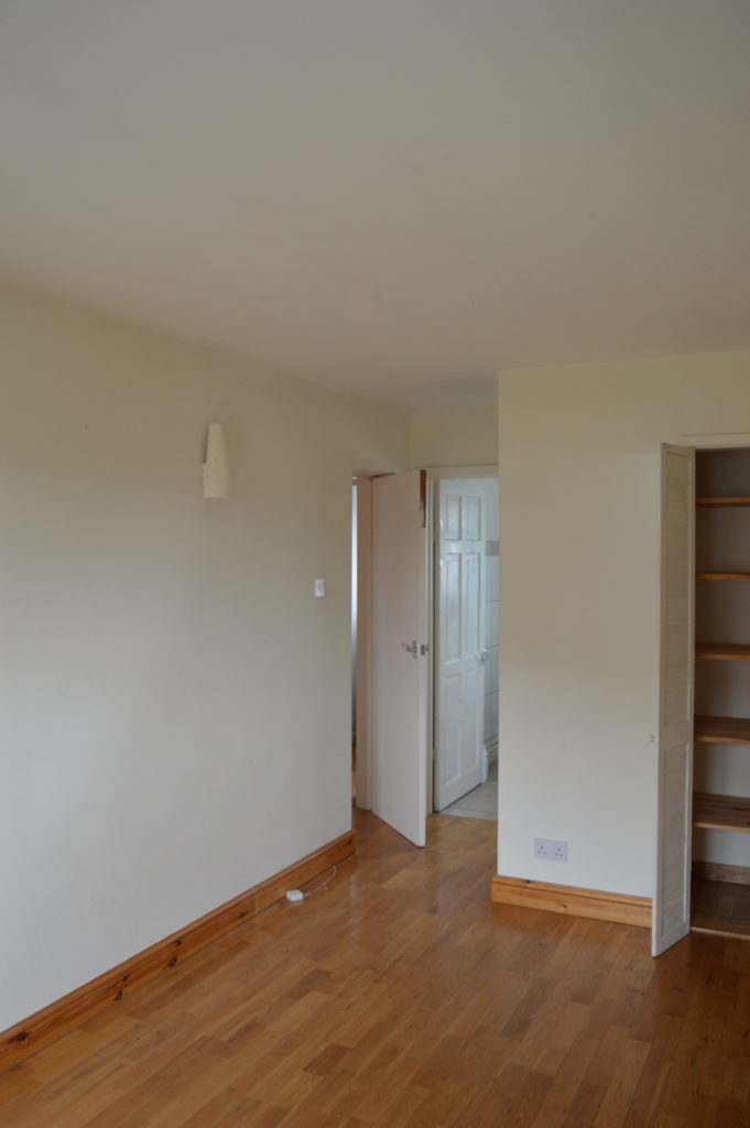
Our home is a 1950s house. At some stage in the 1990s the previous owners did an extension above the garage creating a bedroom and en-suite as seen in the before floorplan below. At 2.40m wide – the width of the garage – the bedroom was very long and narrow with the only window at the end, and the en-suite bathroom was much bigger than the original family bathroom. So I decided to redesign the first floor. As we were converting the loft, I knew I needed space for the new stairs up to the loft so that was my starting point. By removing the box room (the smallest bedroom) I extended the landing to the front wall, not only did this bring light in to the house and make room for the new stairs up to the loft, it give it a ‘always there’ look which I love. Like the house should have always been like this. Loosing the box room and moving the girls’ bedroom wall out also enlarged their room (which is a plus as they share) and gave me the opportunity to create a new entrance to the spare bedroom by the window – leaving me with walls I could use. I then knocked the old family bathroom and toilet together to make a smaller en-suite accessed from a now larger master bedroom. And the old en-suite then became a generous family bathroom. Easy no!?!
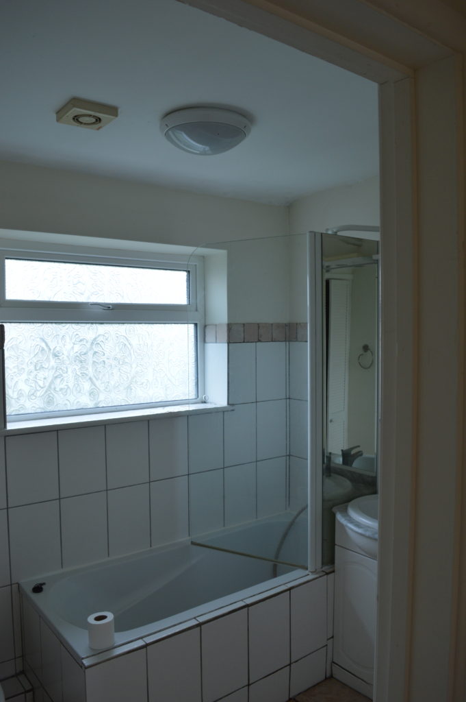
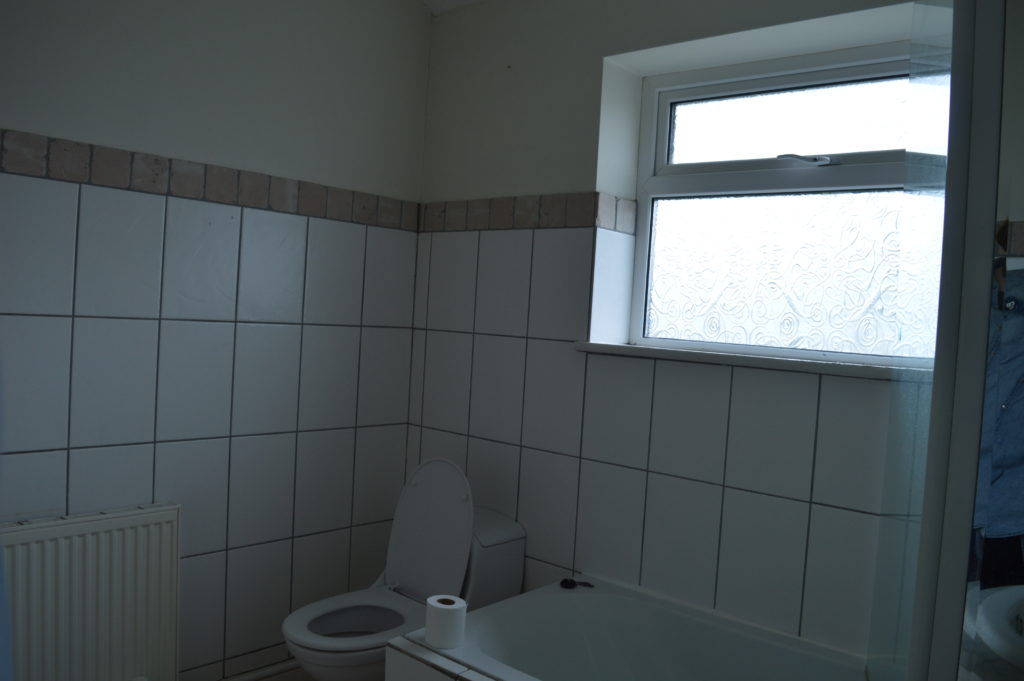
I’ll start with the en-suite to bathroom transformation. Here’s a before photo.
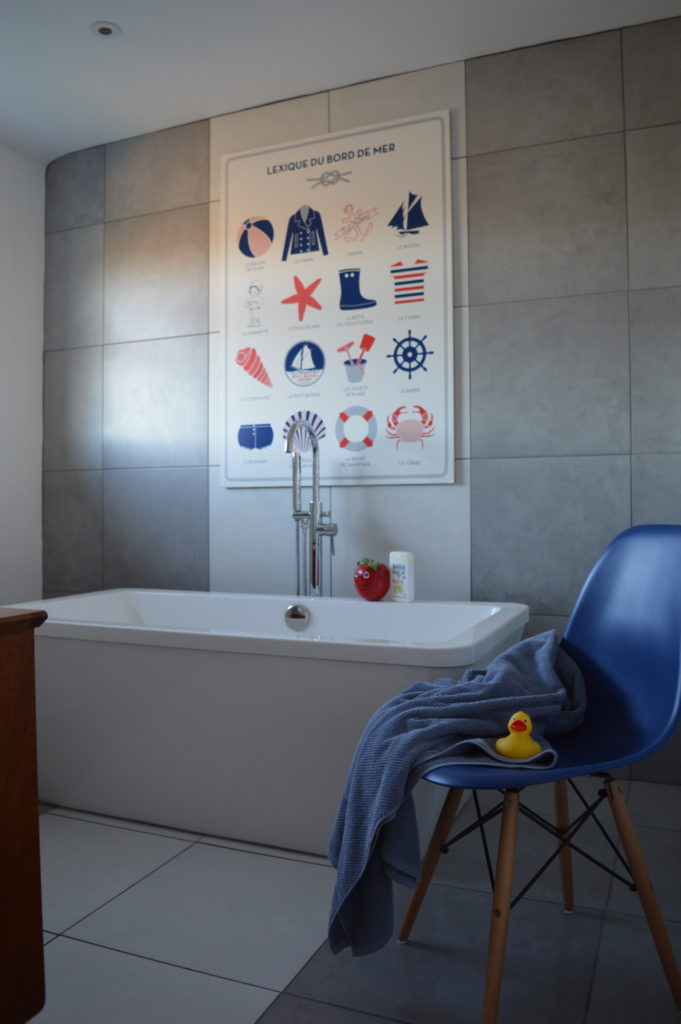
And this is the family bathroom now. With 2 little ones, we wanted just a bath and lots of space around it so we can sit during bathtime. This freestanding bath was in the sale and such a good price, so I took a gamble and bought it before we had completed on the purchase of our house. We keep it in the garden of our rented house for months before it was installed.
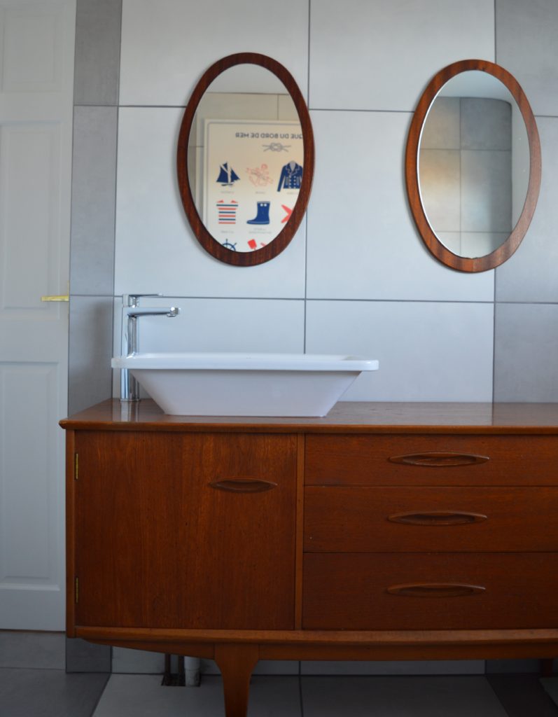
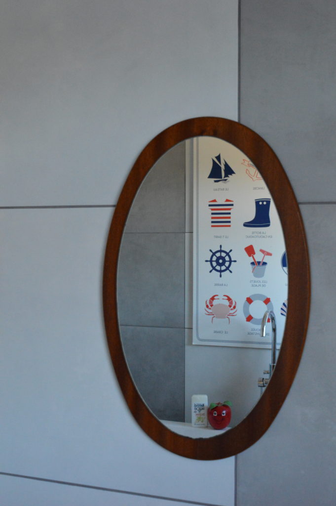
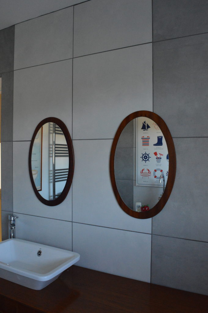
I knew when we bought the house that I would indulge in my love of mid century furniture as not only is it greener to reuse old furniture than buy new, but it also really suits the house. I found this teak sideboard on eBay and then spent far too much time finding matching teak oval mirrors (from 2 different eBayers).
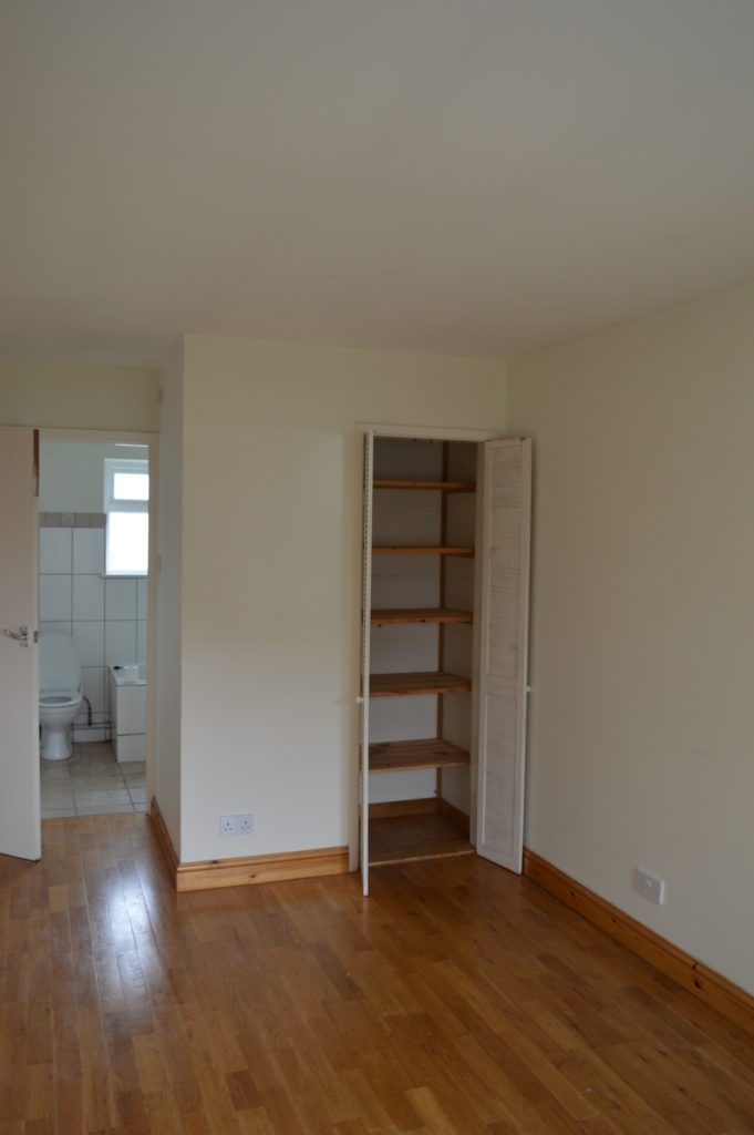
Here’s another before shot.
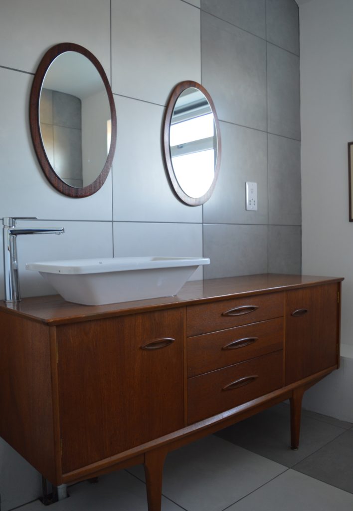
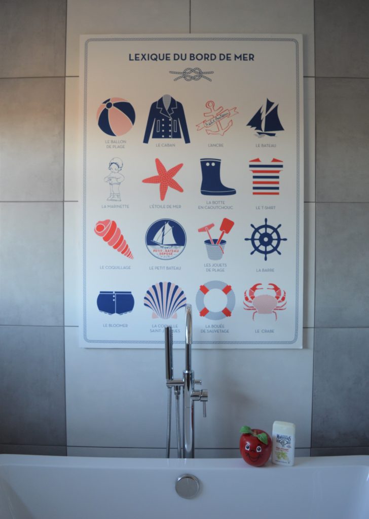
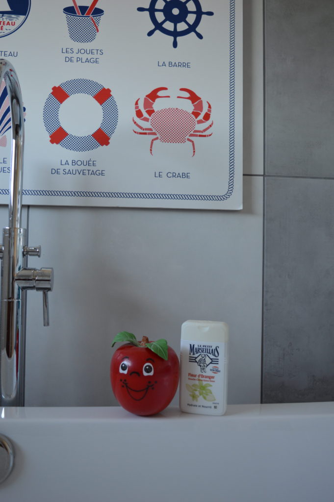
The tiles are from toppstiles and were on sale. I had in my head the idea of doing a white line through the middle of the room; from the top of the wall, across the floor and up the other side. Then accentuated by the mirrors on one side and the Petit Bateau print on the other. I saw this Petit Bateau print in the window of the PB shop in Dubai and managed to convince the owner to give it to me when the window decoration changed. I had it mounted on foam board in Canada. It dictated the addition of navy blue and red in the room.
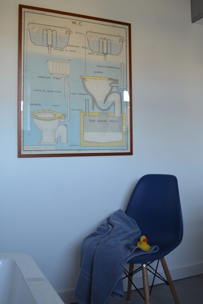
As a French-English family, I love having French art on the walls. I came across this vintage French school poster explaining how toilets work and had to have it in the bathroom. I had it framed in teak to match the sideboard and mirrors. The girls love it!
And of course every family bathroom should have a 1970s Fisher Price Happy Apple: the chiming sound of my childhood baths!
Now moving on to the other side of the old extension to our new guest bedroom. We closed off the old door and crated a new entrance at the other end of the room by the window. As I said this room is very narrow so I had to come up with a solution to have a double bed in there and clothes storage without it feeling cramped. So I asked the builders to build a bed headboard wall: same width as the bed, floor to ceiling and with enough distance from the back wall that it could be a walk through wardrobe.
Et voilà!
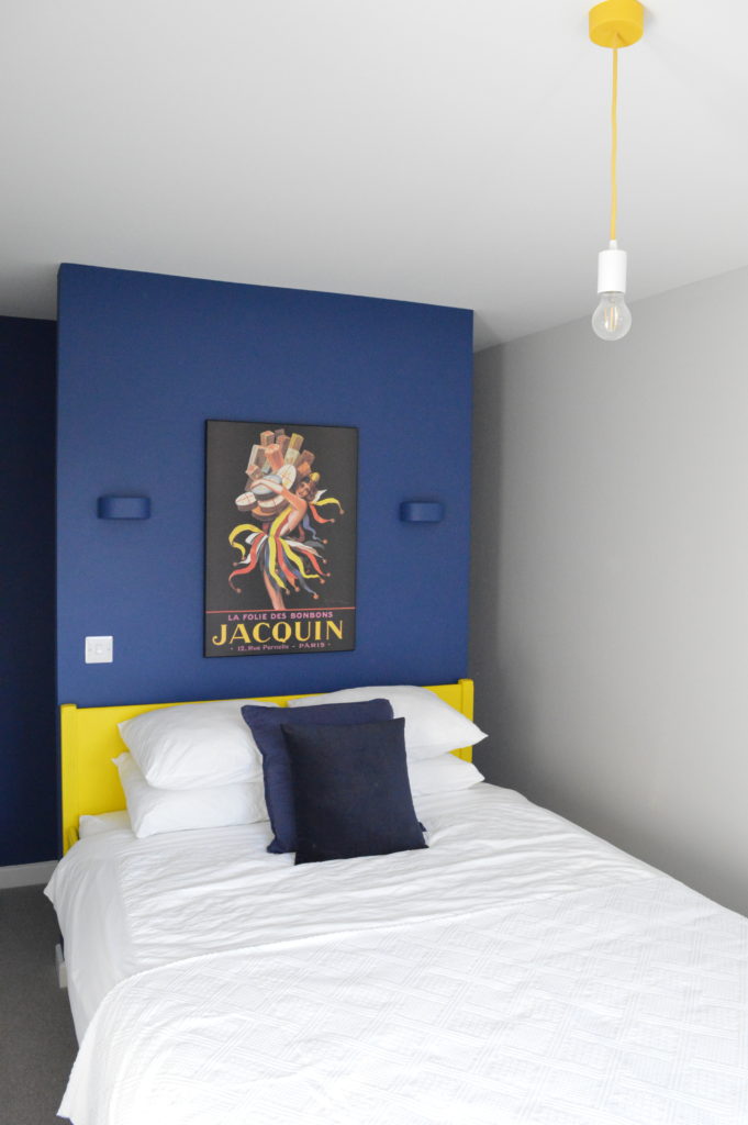
I painted the back wall and bedhead wall the same colour: Dulux Sapphire Salute, so they blend together and the walk through wardrobe disappears. It’s funny but this wall has been people’s favourite part of the house. Even cynical builders, plumbers and electricians have said it was a great idea.
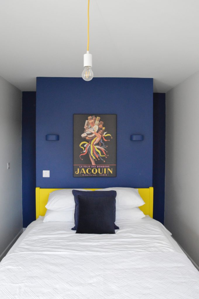
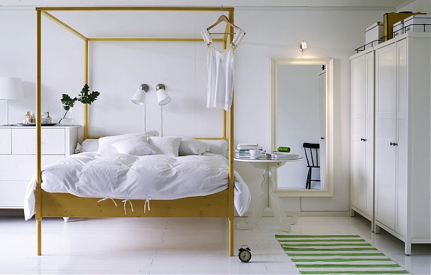
The bed is a “vintage” IKEA Edland bed. Back in 2007 I fell in love with this IKEA 4 poster bed (photo below) but it only came in yellow at the time and I wanted a completely white bedroom, so I painted it white. Fast forward 6 months to when I moved in with my now hubby and he said “he wouldn’t be seen dead sleeping in a 4 poster bed” so he sawed the posts off. It was our bed and then our tenants’ bed. Now it’s our spare bed and it’s yellow again! Sadly I couldn’t put the 4 posts back on but I still love it. Who says IKEA doesn’t last?
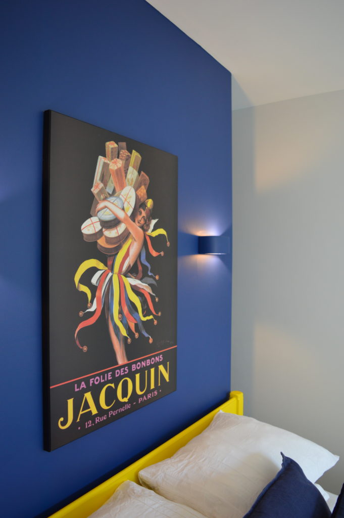
The main focus of this room is a poster I found in Toronto: La folie des bonbons. It also dictated the pop of yellow with the blue. I was buying 2 mid century chairs (one of which is also in this room) from a kijiji seller (kijiji is an online Canadian Classifieds) and saw the poster up on the wall of his garage. He sold it to me for $10CA as he said my eyes lit up when I saw it! I had it ‘plak-it’: mounted on a wood board.
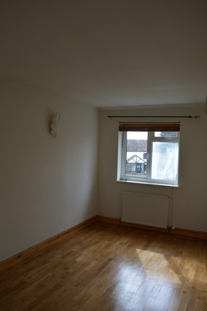
As you can see here in the before photo, the double glazing was shot. We replaced all the windows in the house with new triple glazed argon gas filled aluminium windows. Anthracite grey on the outside and white on the inside. We also completely rewired and re-plumbed the house.
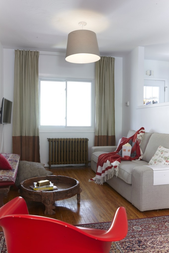
I love the IKEA AINA linen curtains, they come in perfect beige and used to come in perfect light grey (they are also available in dark grey, white and blue which may be perfect for you!). I bought all the stock I could find of the light grey before it was discontinued. I have used them religiously over the years in all our homes over black out blinds. My mum did an amazing job customising the beige ones with rust velvet when we lived in Canada (photo below).
And in our home she has made 3 roman blinds with the curtains, two in the beige for the entrance hall and landing and a lined one here in the light grey. It totally rocks having a curtain maker mum!
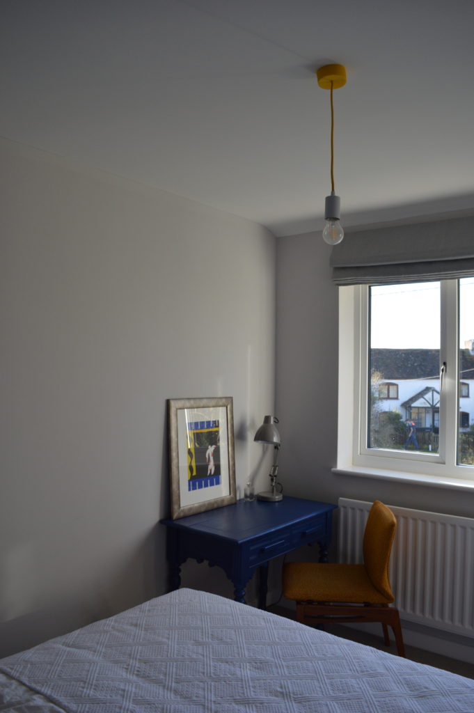
The desk was mine when I was a teenager. It used to be black and you might have spotted it in our flat in London. To modernise it, my husband painted it Dulux Sapphire Salute in eggshell. I love the matte blue against the light grey.
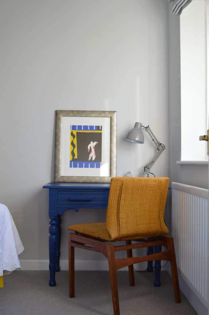
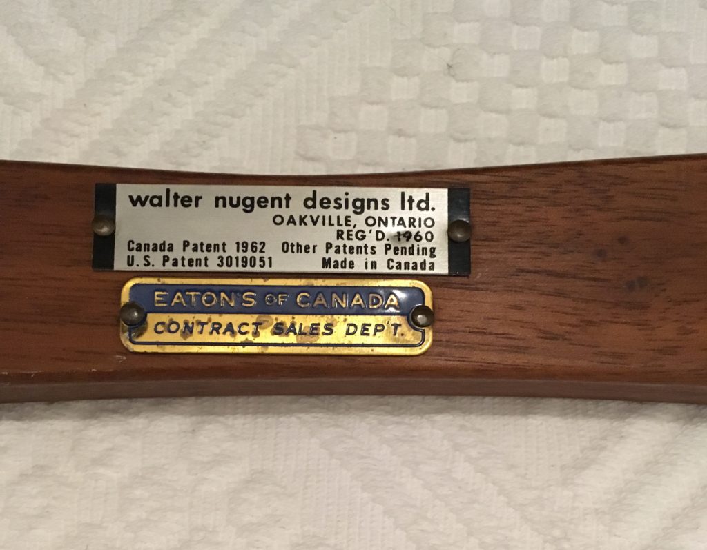
As I said earlier this chair was bought on kijiji in Toronto. I was so excited when we moved to Canada from Dubai, that I could buy mid-century furniture at a reasonable price. I love that this chair was from the contract sales department at Eatons of Canada. It is not only beautiful but so comfortable. I wonder what sales were made it in back in the 1960s?
I hope you’re inspired!
