No28 is my mum’s house – not her home but a house she owns in the UK. She bought it in July and it was our temporary home whilst we found new builders and finished our home. After we moved out, my mum asked me to redecorate the house in true HMP style: using the furniture and pictures she had, upcycling items where needed but most of all, keeping the budget really low. No28 is a 15 year old town house in the old brewery area of Abingdon and it’s a 3 bedroom house. I know it’s not very British to talk money but I want to give you some context; to decorate this house from top to bottom I had £6,000. And that budget was to include everything – trades and, fixtures and fittings – to get it ‘move in’ ready for her and or short term tenants.
As it’s a relatively modern house in a very cool brewery area so I wanted to take it from magnolia boring to industrial modern. Brick, grey and of course some velvet.
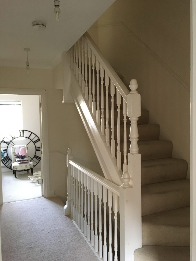
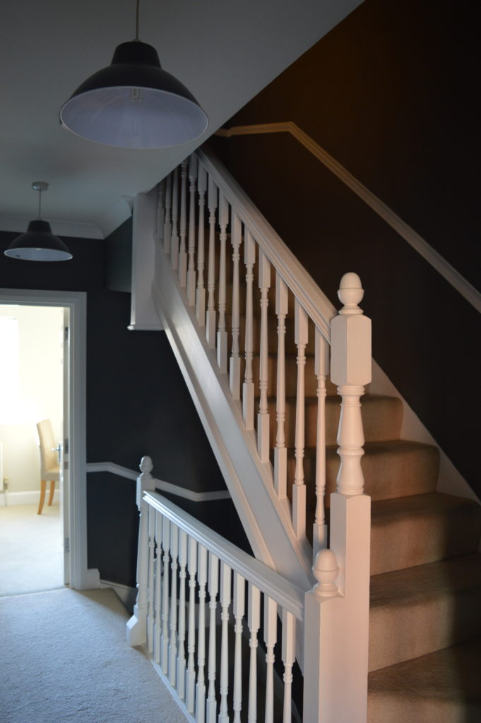
Sorry this is a long post, but it made sense to include the house in one. Here are the before and after photos starting at the entrance. I wanted to make the entrance, landing and stairs a feature by using a dark colour.
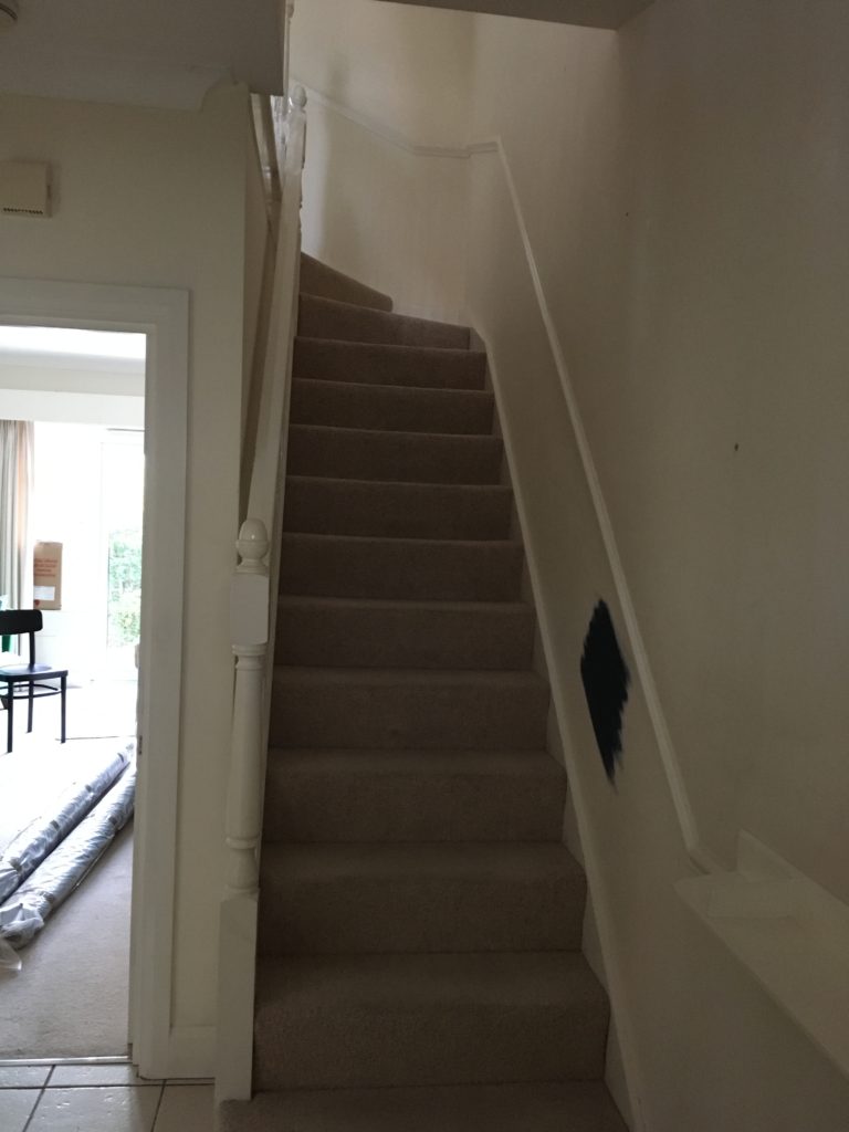
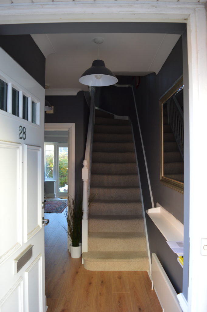
I chose Dulux Night Jewels 3, a darker shade than the grey I picked for my home. It looks great with all the white woodwork.
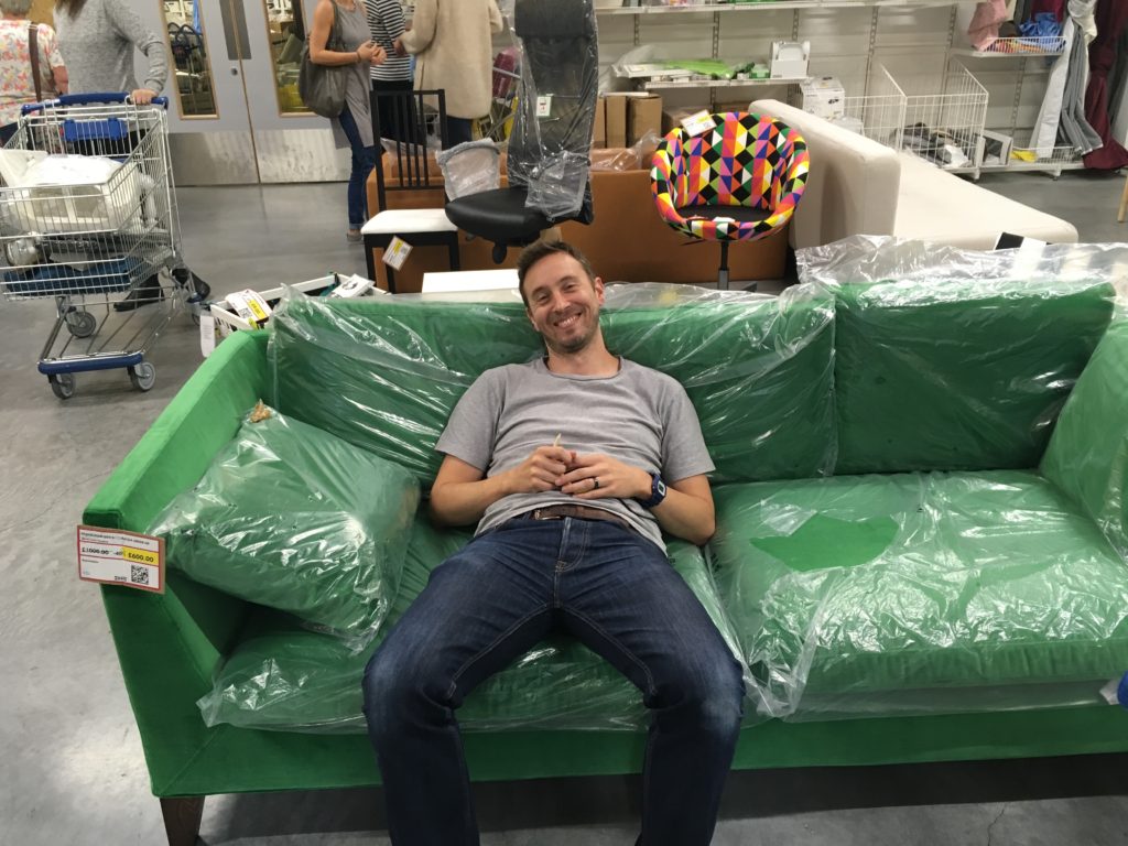
For the sitting room I had to go with a very on trend velvet sofa. Initially I was going to recover a sofa I bought on eBay for 99p in navy velvet (you can spot the sofa in the before photos). But during a trip to IKEA I came across a IKEA STOCKHOLM sofa in green velvet in the bargain corner and I couldn’t resist. Such good value! That’s my husband modelling it.
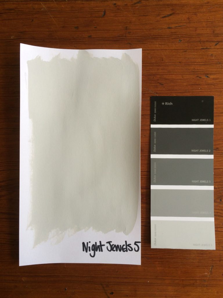
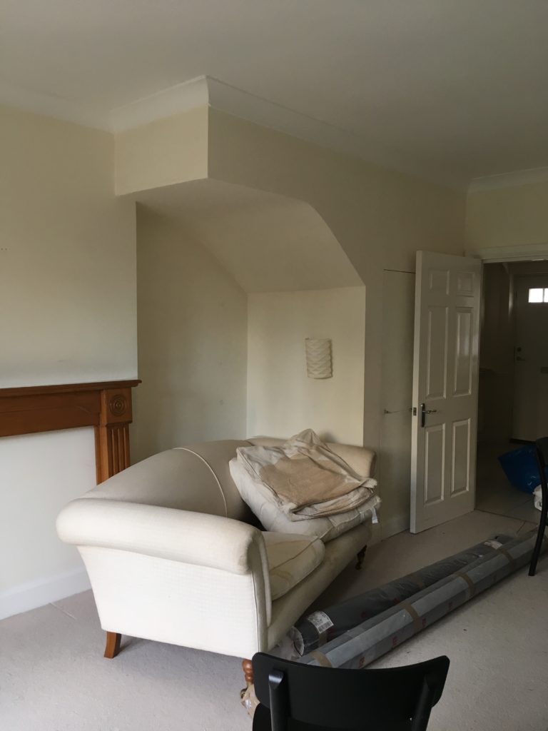
The sitting room went from magnolia to Dulux Night Jewels 5 – my favourite grey. And I had the carpet and tiles taken up and replaced with an oak laminate from front door to back door, to unify the space. Modern laminate is brilliant, it has a textured grain and grooves between the boards so apart from the huge difference in price, you don’t notice that the floor isn’t wood.
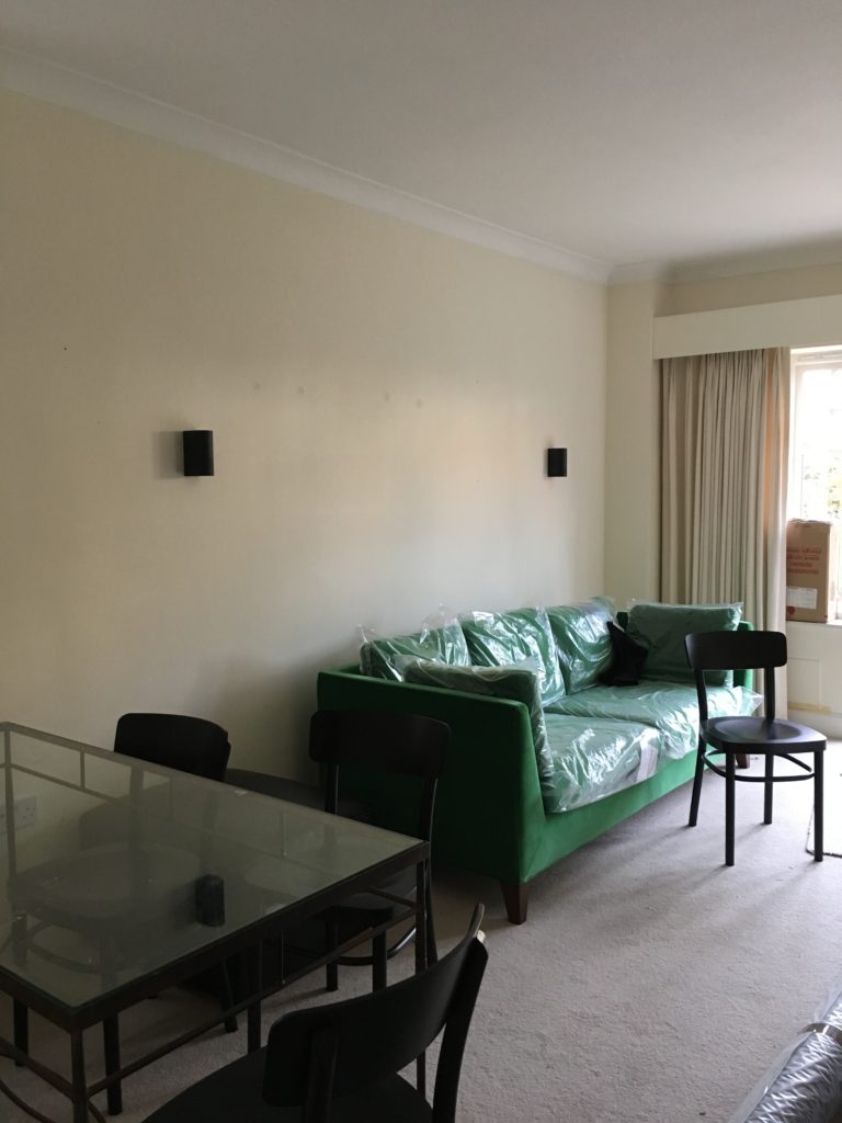
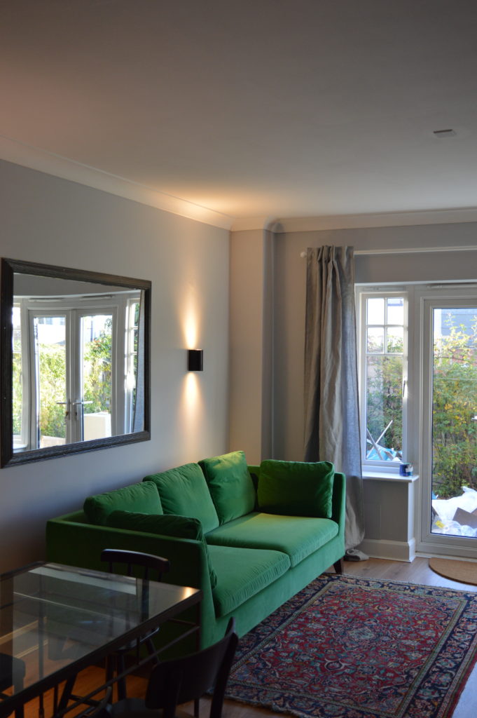
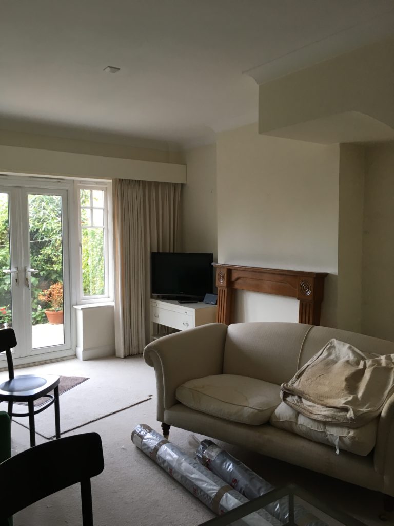
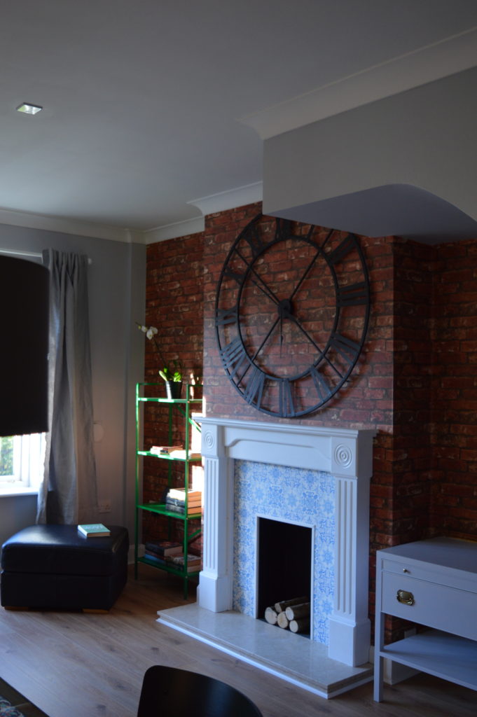
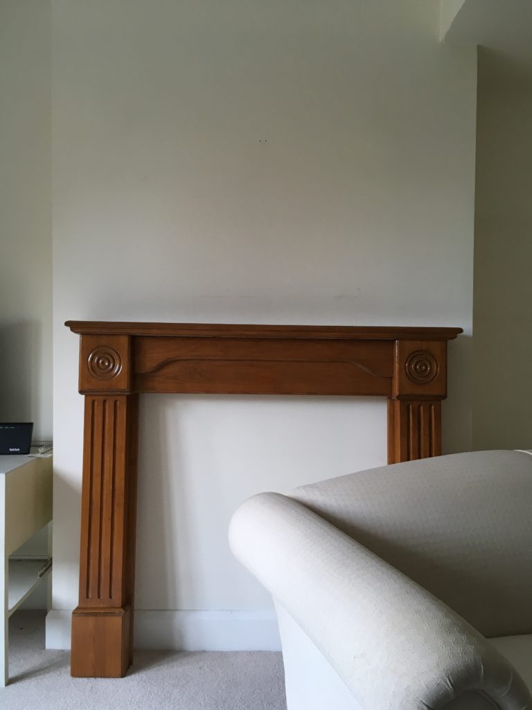
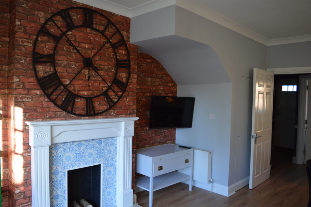
Introducing a fireplace to the room was a key design decision. I wanted to add focus to the room and bring in some character. The brick wallpaper helps too. I found the surround and hearth on eBay. The lady who sold it to me, told me her father built the surround. And Steve from W J ARMSTRONG (CONSTRUCTION) LTD did the necessary carpentry. The tile wallpaper is from B&Q.
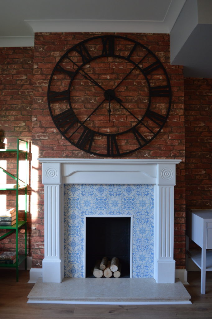
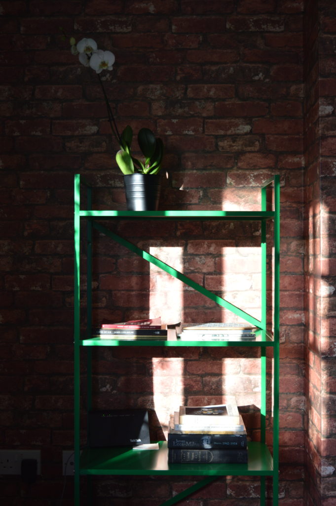
I love the new IKEA DRAGET shelving unit. I have it in grey at home and the green here is great against the brick wallpaper and of course it matches the sofa.
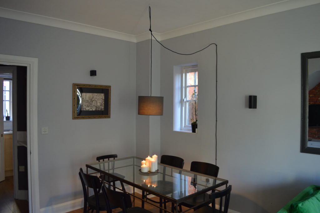
Like in a lot of open plan rooms, it was important to zone the dining area.
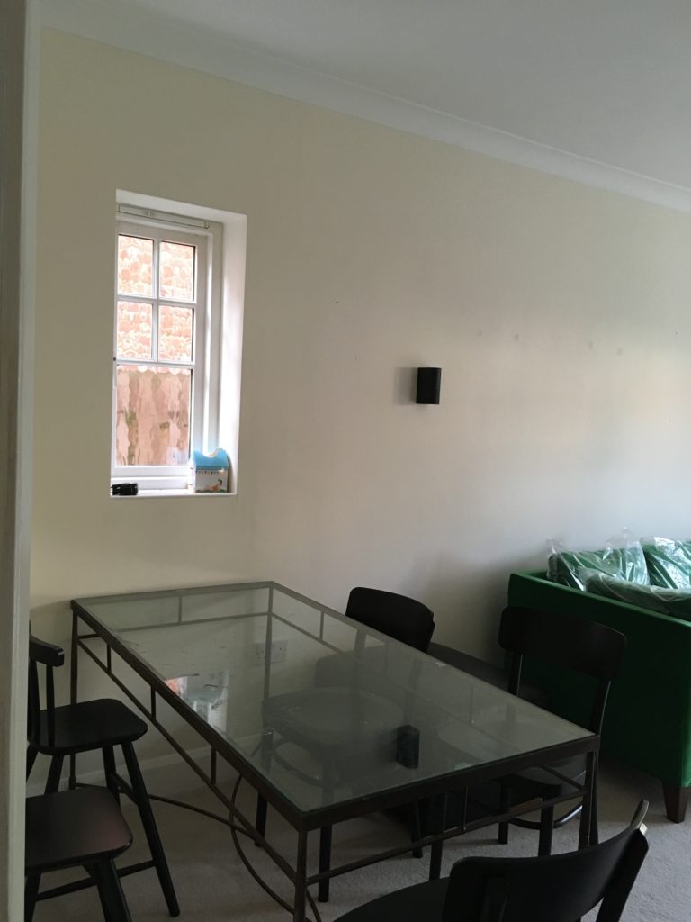
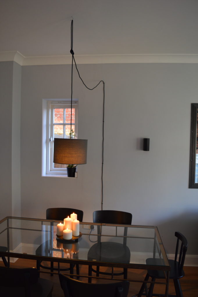
To zone the dining area I designed a pendant light to be plugged into the wall socket and then hung from the ceiling. This avoided any expensive electrical work but still give the effect of warm lighting over the table. I made the pendant with items from Creative cables.
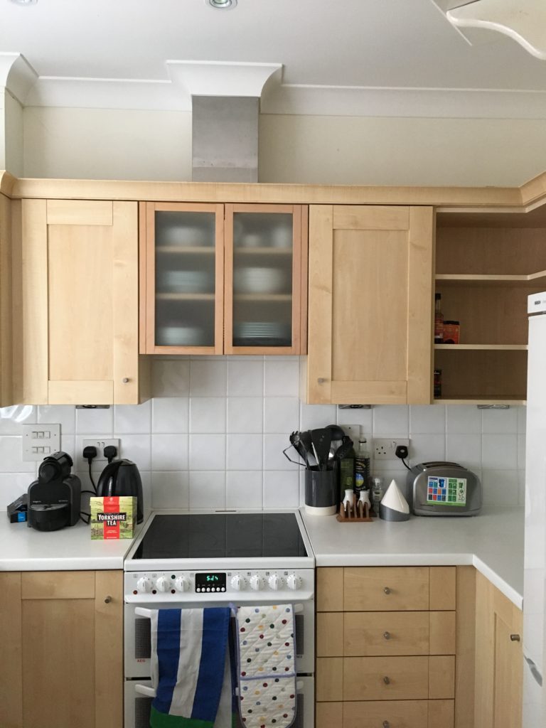
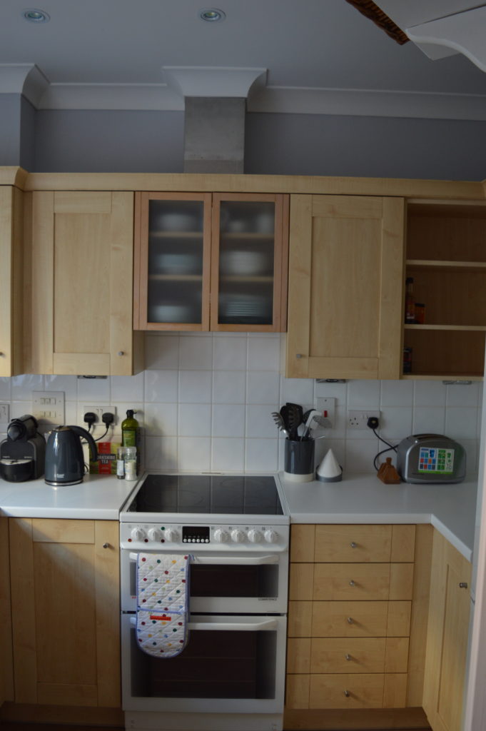
The kitchen was completely functional and I decided it would be a waste of money to replace it. Instead it got a good clean, new laminate flooring and a lick of grey paint. Oh and of course every dark grey appliance I could get my hands on!
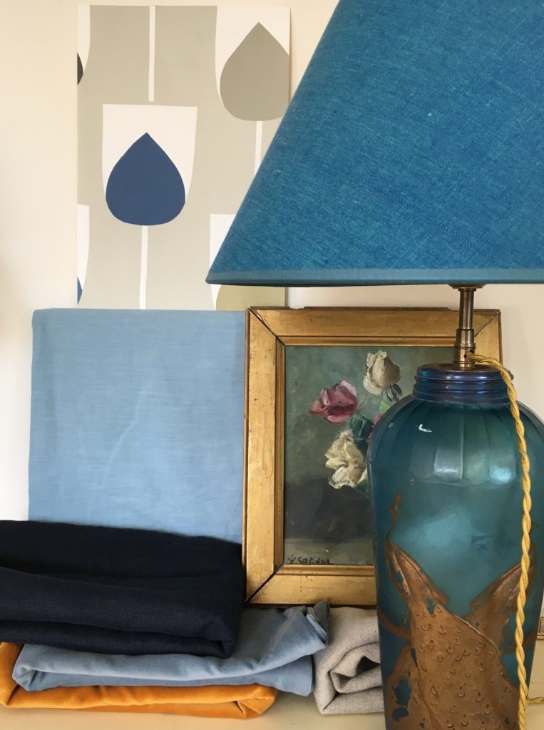
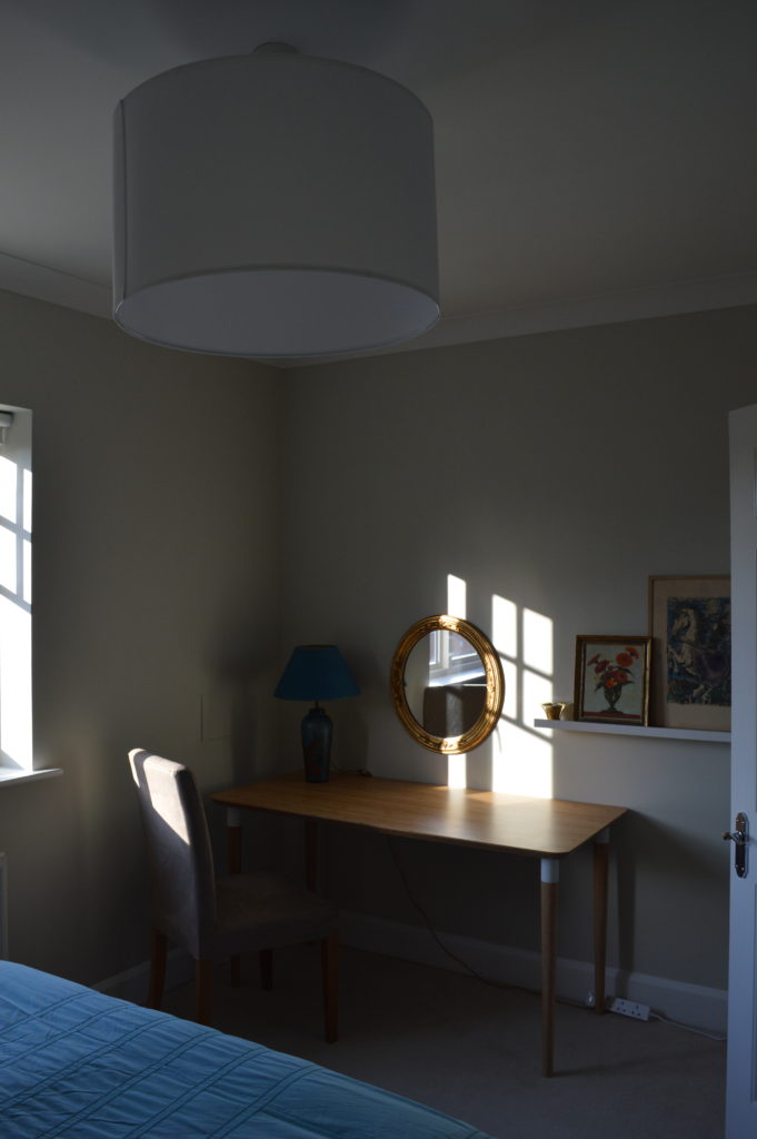
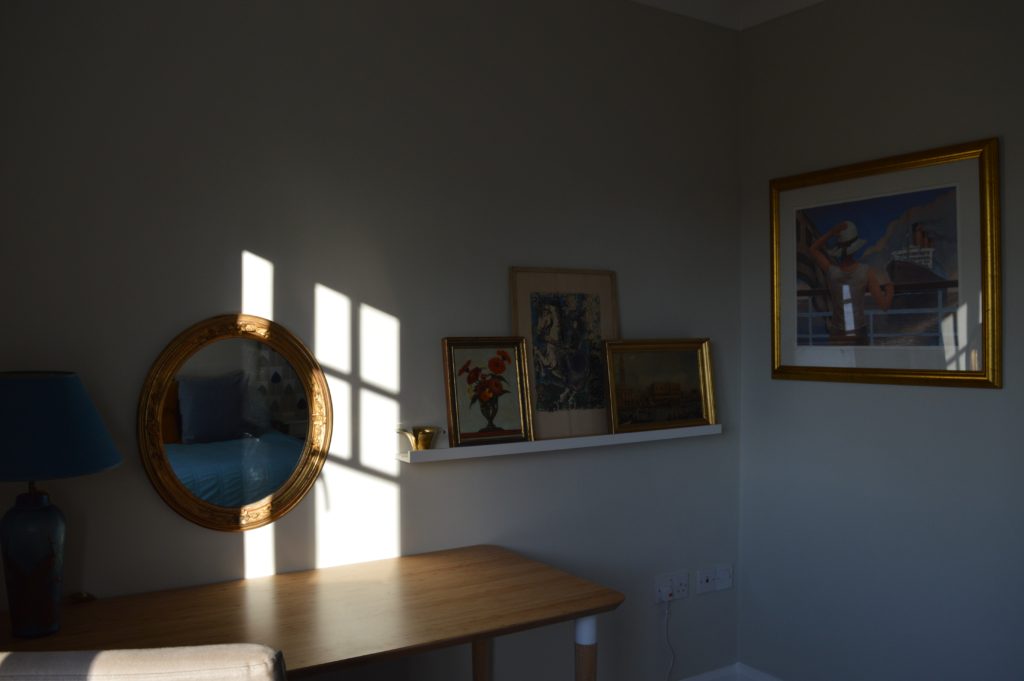
As I mentioned at the beginning, the HMP ethos is to work with what you have. Amongst my mum’s items, I found some gorgeous blue and gold lamps, some blue bedding and a good collection of gold framed pictures. The blue and gold bedroom design was born. I built on what I had and created a cohesive styleboard.
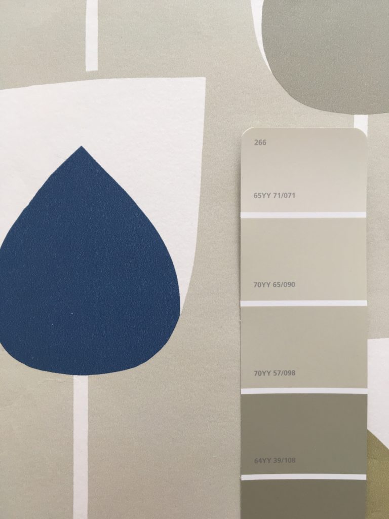
I picked out the Scion Sula Wallpaper in Indigo & Sapphire for a feature wall and colour matched the background for the other walls.
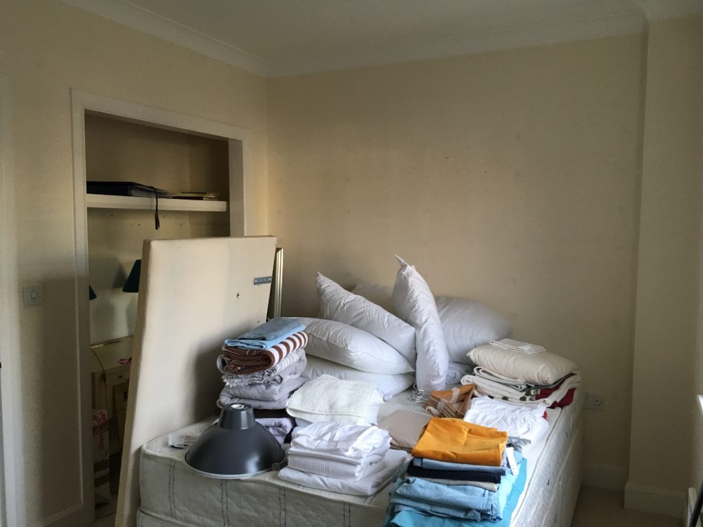
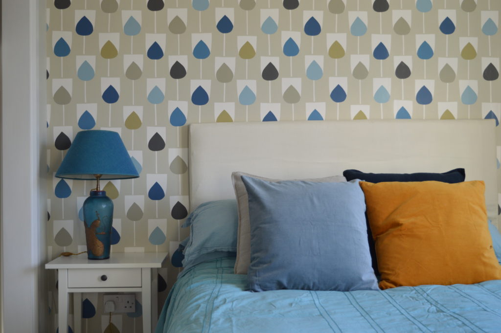
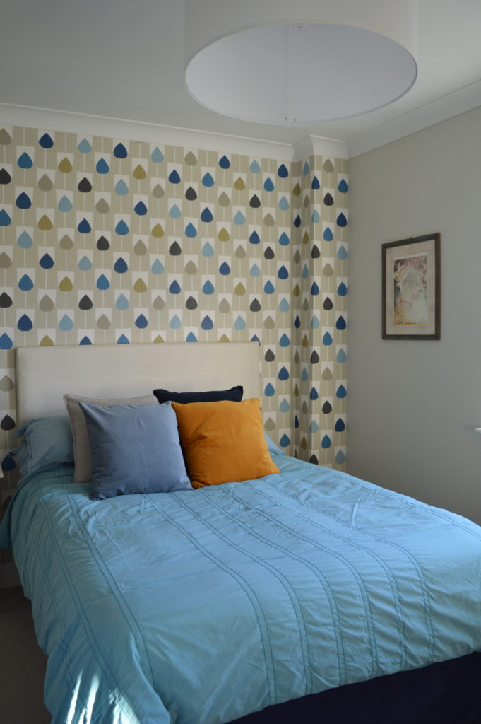
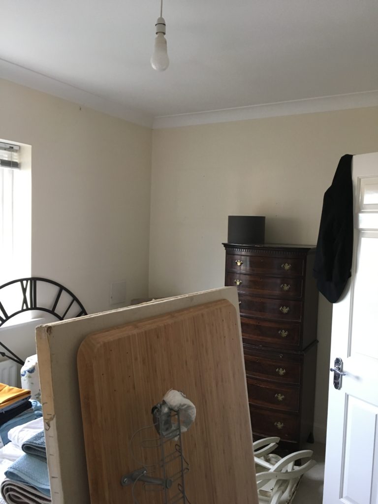
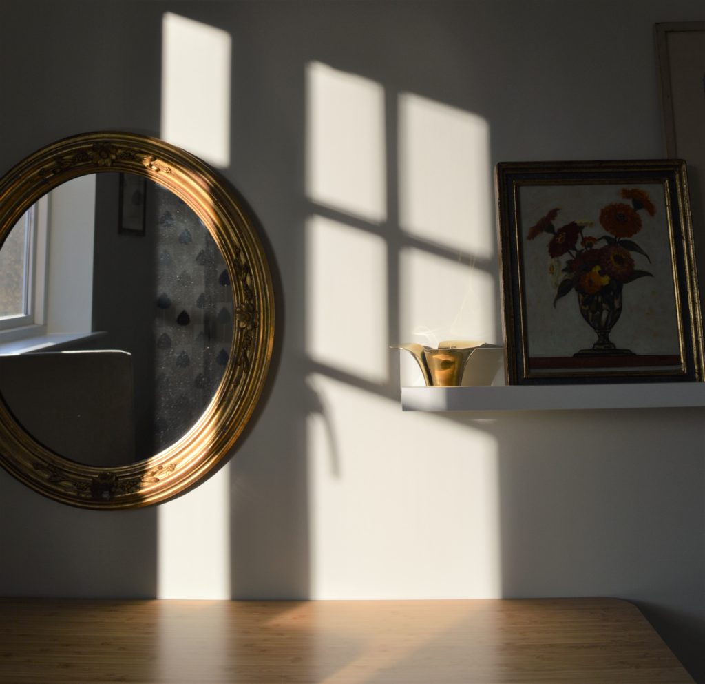
So the collection of gold framed pictures didn’t look too old fashioned, I grouped them on a picture ledge. The pre-loved table can be used as a desk or a dressing table. (Sorry for the contrasted afternoon light.)
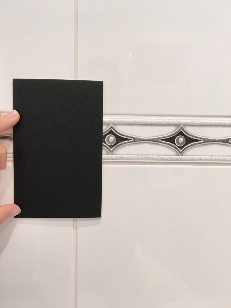
With the bathroom and matching en-suite, I started with what was there: the tile pattern you can see here. I decided to pick out the black and use it to modernise the bathrooms at little cost. I chose plain black vinyl for the floors and the boys at Fine Finishing helped me out again by spray painting the towel rails matte black.
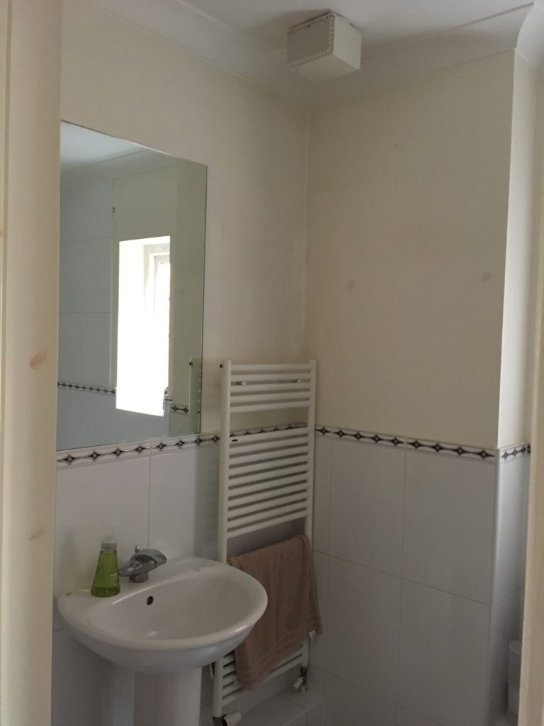
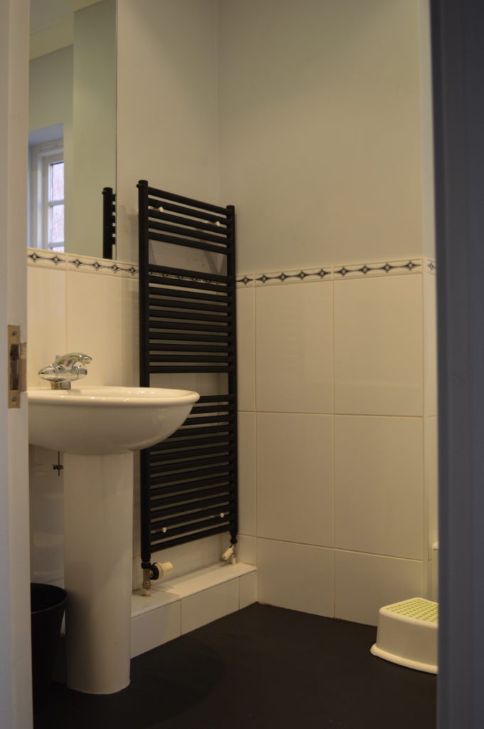
Continuing on from the landing and up the whole heart of the house, the dark grey Dulux Night Jewels 3.
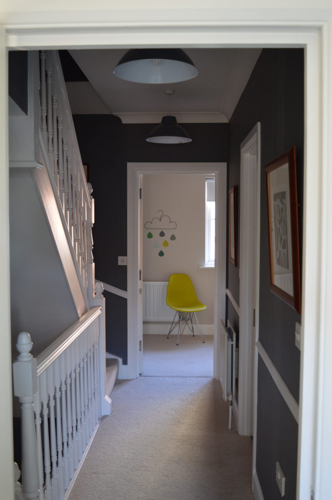
In the weekend before we moved into the house, my husband, father in law and I decorated this green bedroom so our girls would feel more settled in this temporary home. Here is the post I did at the time. The girls have since moved into their new bedroom with their personal items so this room is more pared back now. Again I chose the Scion Sula Wallpaper but this time in Juniper & Kiwi.
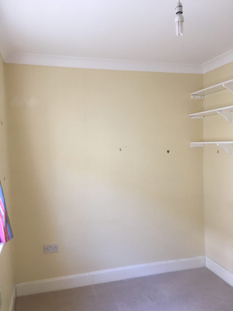
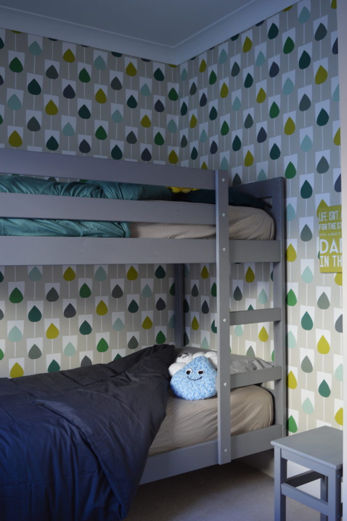
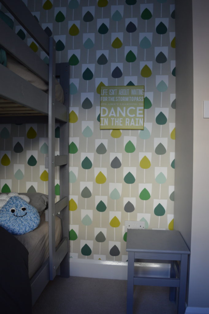
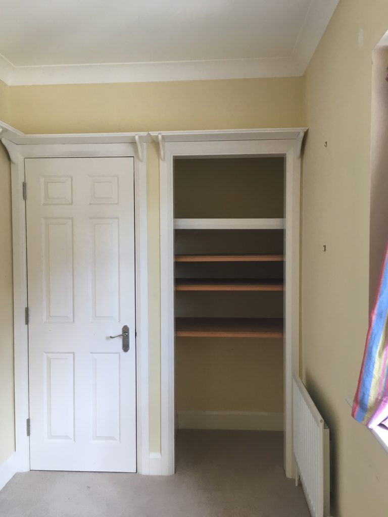
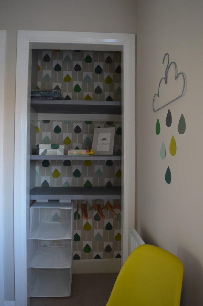
And up to the 2nd floor.
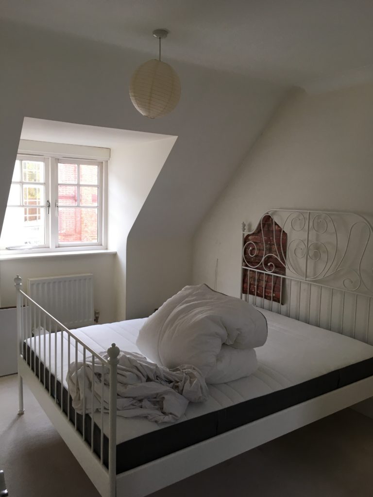
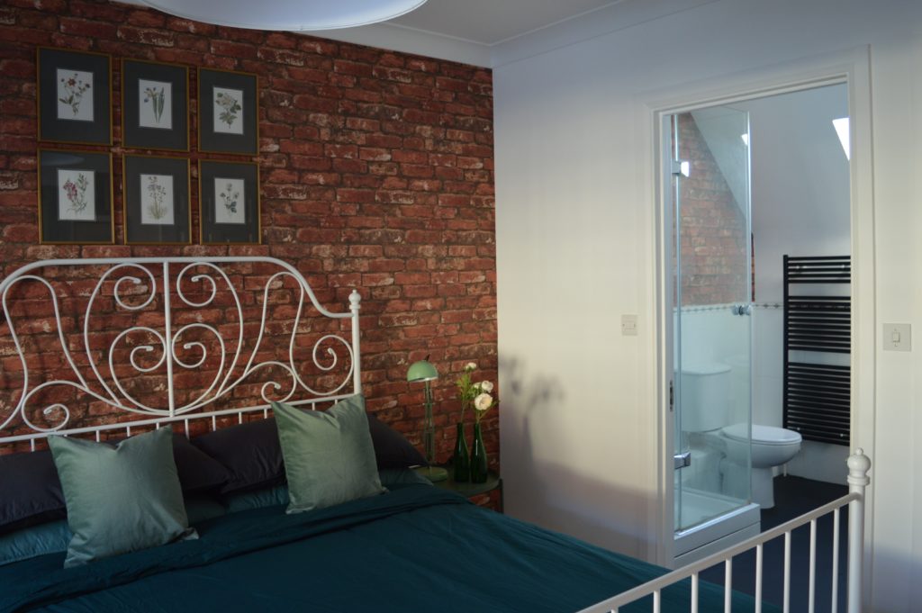
In the master bedroom, the only item I had to work with was the IKEA LEIRVIK bed frame in white. It’s a bit girly for my taste so I wanted to contrast it with something more modern so I chose to reuse the brick wallpaper from the sitting room. The whole old brewery area is red brick so I love how this house reflects its surroundings. I picked out the flower pictures from my mum’s collection and from there focused on a green palette.
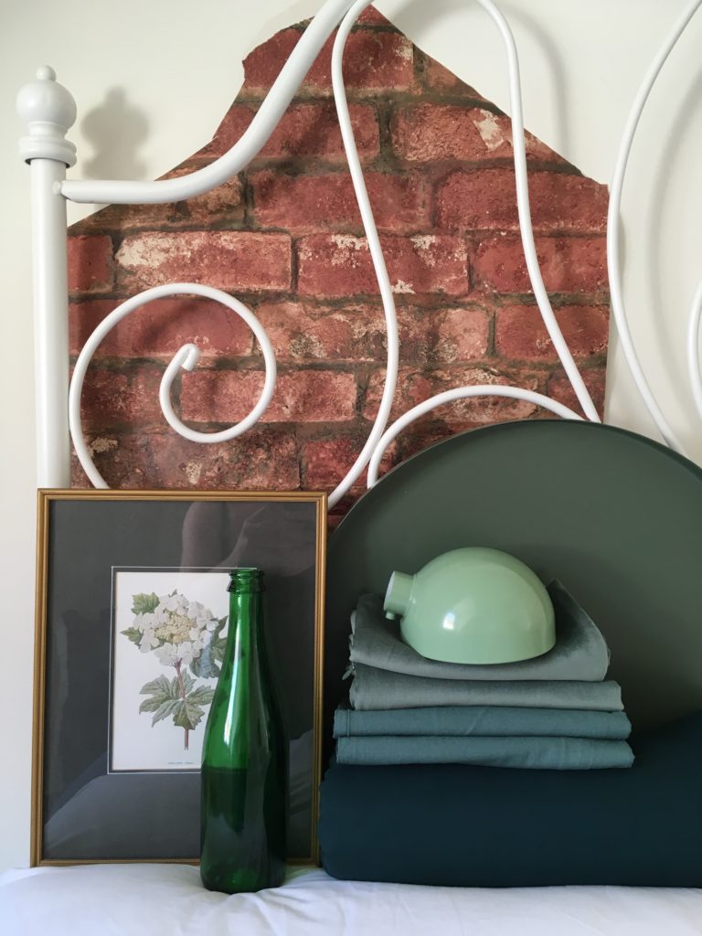
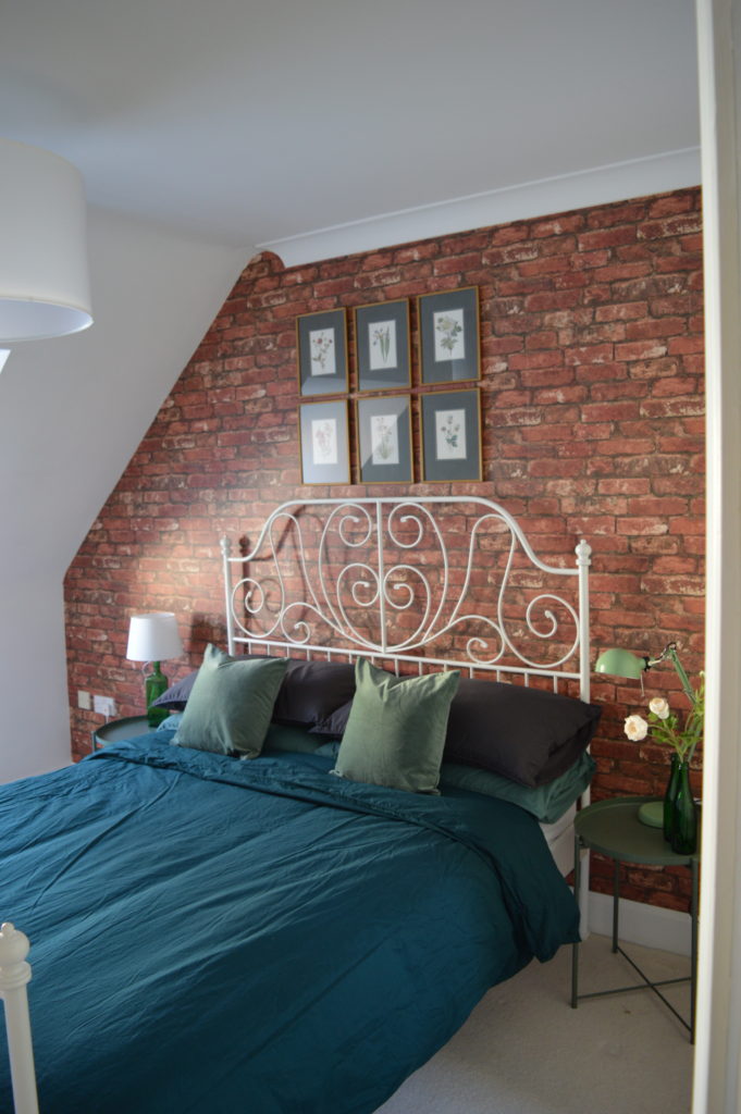
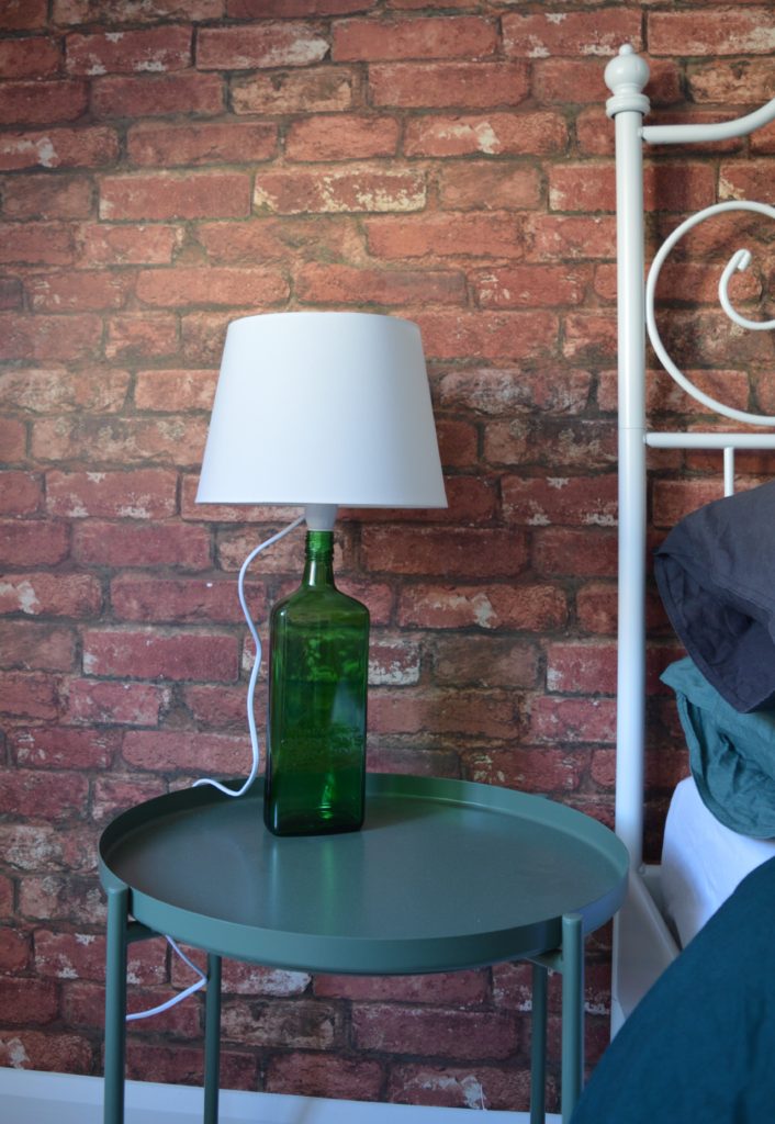
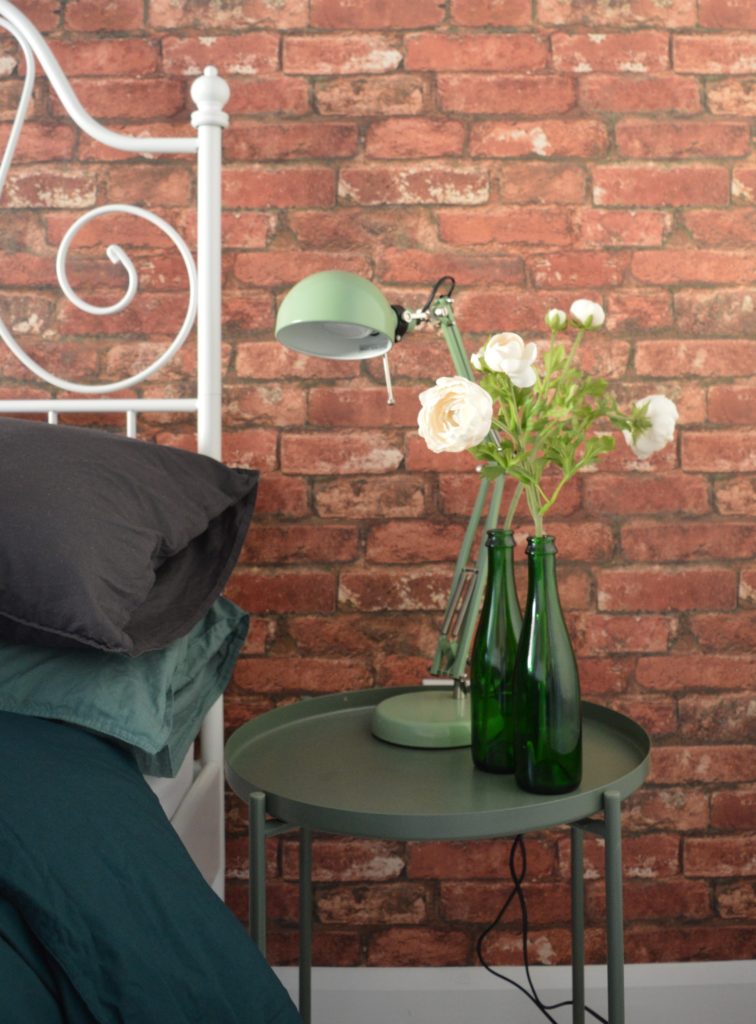
The new IKEA GLADOM tray table (pictured here in dark green but also available in white and yellow) has been acclaimed by the interior design media. As the budget was low, I used beer bottles for vases and a Gordon’s gin bottle for one of the bedside lights. The other bedside light is the IKEA FORSA work lamp.
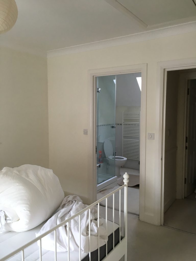
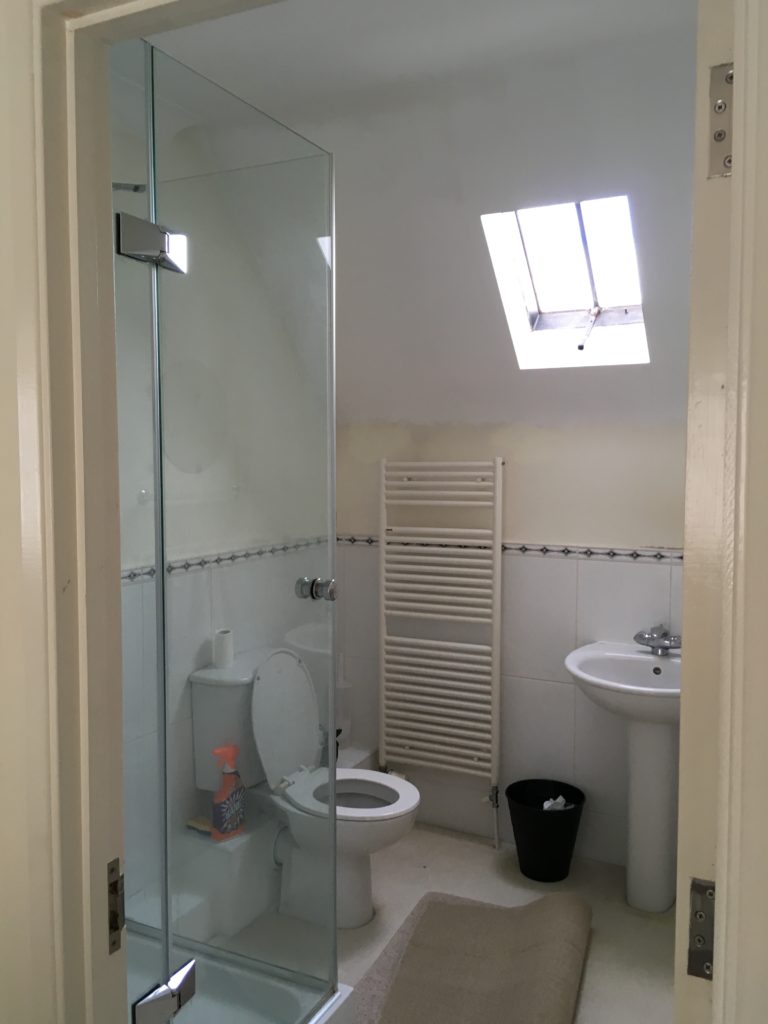
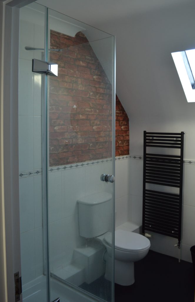
I continued the brick wallpaper into the ensuite. And again I used black plain vinyl and spray painted matte black towel rail to update the look.
I hope you’re inspired!
